From Insights to Impact: Presentation Skills Every Data Scientist Needs
How to structure, design, and deliver data presentations that win over stakeholders
Being a data scientist today is more than just a technical role. It has evolved into a highly cross-functional job, as you need to explain your data insights and sell your ideas to your stakeholders to drive real business impacts. Therefore, to be a successful data scientist, presentation is an essential skill —many times using old-school PowerPoint or Google Slides. However, it is a skill that is usually missing from entry-level data scientists and analysts who focus heavily on technical skills.
In this article, I will share the presentation format that I have found most effective from numerous presentations I had to give during my seven years as a data scientist. I will also walk you through slide examples, which I created using fake data for illustration purposes. Hopefully, this will help you improve your presentation skills and advance your data career.
Please note that this article focuses on the presentation step, assuming you already have a solid analysis or model :)
Part I — Context
To kick off your presentation, you should start with the project context to set the stage and align the expectations, just in case not all of the audience is already aware of the business problem. This section should be concise with a maximum of 2 slides. It should cover:
- Goal: What business question you are trying to solve? Is it analyzing the outcome of an experiment or building a machine learning model to predict customer churn? Does it come from a recent metrics trend or follow a product change?
- Supplementary Context: You should also include other key information about the projects. For example, if you are presenting an experiment analysis, you should briefly talk about the experiment design and target population; For a machine learning model, you should provide an overview of the training data quickly.
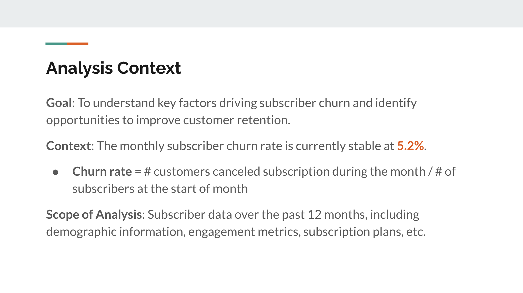
Let’s say you are a data scientist at a subscription-based B2C company (for example, Netflix, HelloFresh, The Economist, etc.). You have conducted an analysis to identify the drivers of subscriber churn and you are going to present your findings. Here is a sample slide that effectively introduces the analysis context:
Part II — Key Insights and Recommendations
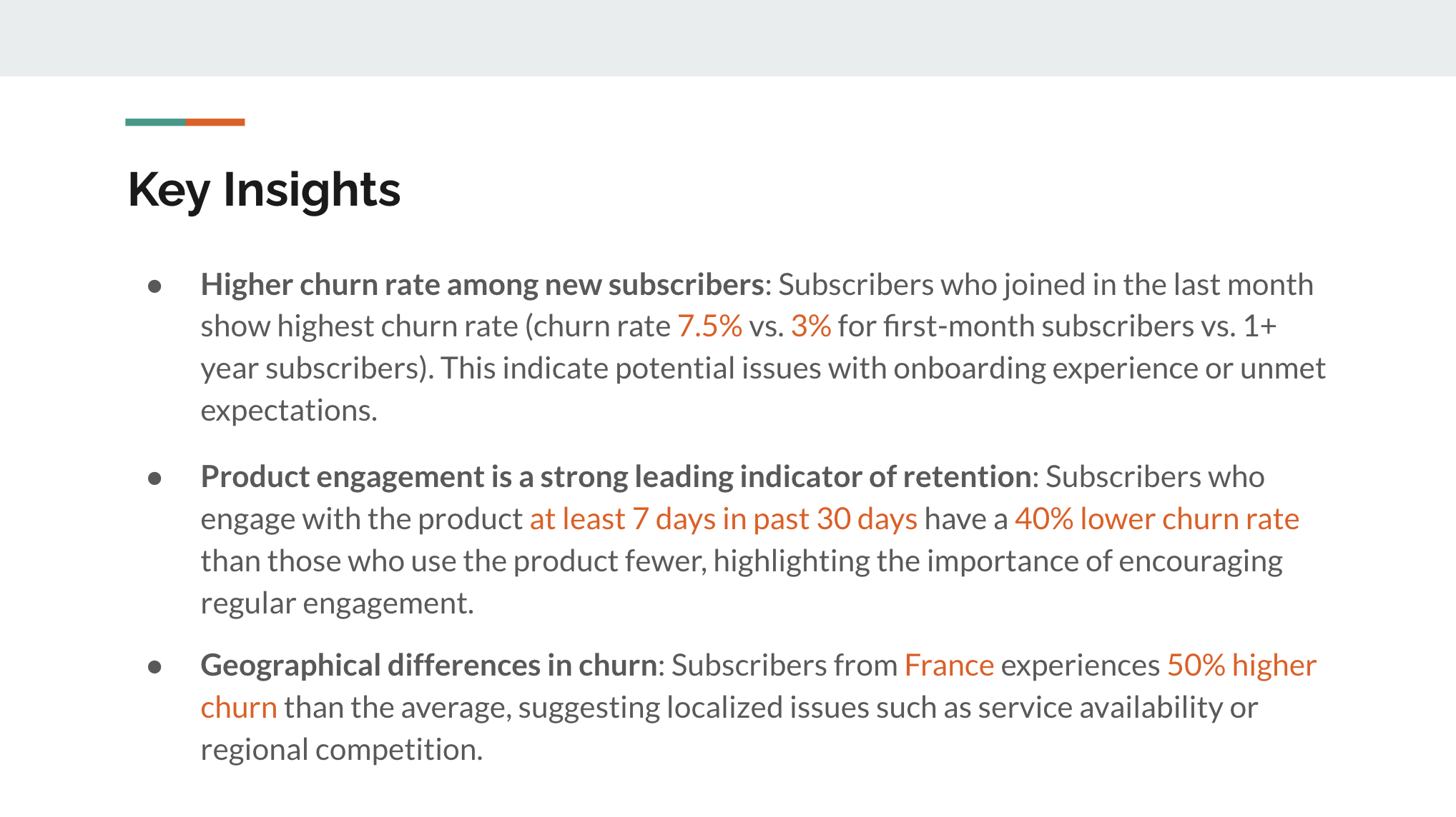
This might not be a conventional idea, but I recommend sharing your key insights and recommendations before diving into the analysis details. Why? This helps you capture the attention of your audience as the decision-makers are most interested in the actions. It also makes it easier for the audience to connect the dots later when you go through the detailed analysis.
Here are some tips to make this section effective:
- Pick 3 to 5 most important insights. Make sure to include data points in your key insights to increase credibility.
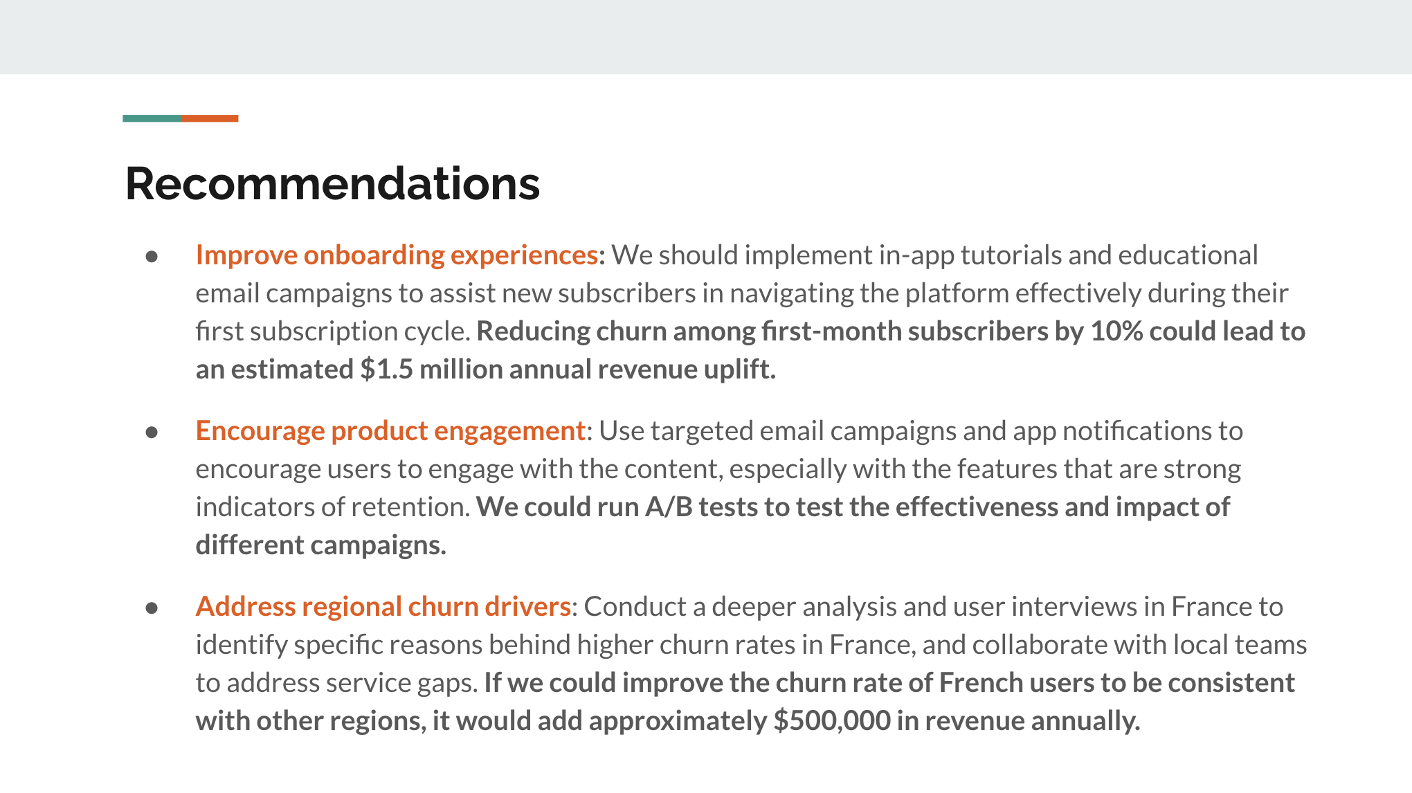
- Provide actionable recommendations. The recommendations should be directly linked to the key insights, and be logical and practical for the stakeholders. If possible, add the opportunity sizing of your recommendations. This will help your stakeholders understand the potential impact and prioritize the ideas.
Here are the example slides (with made-up data for illustration purposes). I like to use color and bold fonts to highlight the key data points and messages.
Part III — Detailed Analysis
Next, it’s your time to present your analytical process. Your analysis should serve as the supporting evidence for the key insights and recommendations you shared earlier. Therefore, you should be selective, instead of overwhelming your audience with all the analysis details. They should also form a logical storyline that connects your findings.
What makes good analysis slides?
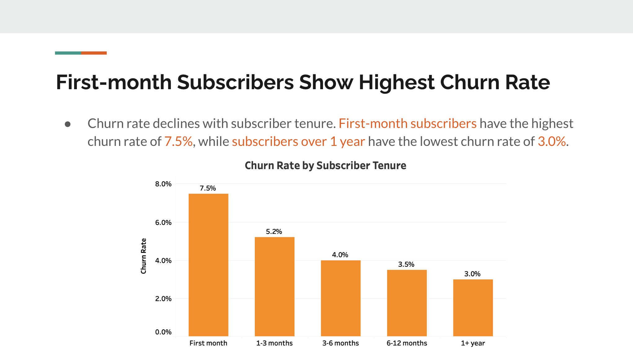
- Summarize insight in the slide title: Instead of using generic keywords like “trend analysis” or “churn rate by tenure” as the slide title, I recommend using a one-sentence summary, such as “churn rate is 15% higher for mobile users”. This guides focus and improves the storytelling efficiency.
- Limit text on the slides: Don’t dump too much text on the slides. It’s hard for your audience to read a long paragraph while listening to what you are talking about.
- Polish your visualizations: On the other hand, visualizations are a better way to explain your insights intuitively. Effective visualizations should be simple and uncluttered, use easy-to-follow chart types, have appropriate (and large enough) labels, and follow a consistent design style.
As shown in the slide example below, the slide title summarises the finding, followed by a short explanation and a clear chart supporting it.
Part IV — Summary Slides
After going through your detailed analysis, I recommend wrapping up your presentation by repeating the key insights and recommendations. This might sound redundant, but it reinforces your conclusions and sets the stage for Q&As. You can simply copy and paste the slides at the beginning.
Part V — Appendix
The above four sections cover all the slides you want to go through during the presentation. However, it is always a good idea to prepare additional slides in the appendix to cover the following topics:
- Answers for the anticipated Q&A topics — It is not uncommon to foresee certain questions coming up during the Q&A, especially when you have done your mock presentation with your teammate. Preparing slides to address those questions can help you feel less nervous during the presentation and make you look more prepared in front of the stakeholders.
- Technical details — If your audience includes both technical and non-technical stakeholders, you might want to include the technical details in the appendix, in case someone wants to learn more about your methodology.
- More supporting data and visualizations — Given the time limit, there might be more interesting data points that you could not cover in the presentation. You can also save them in the appendix for further reading.
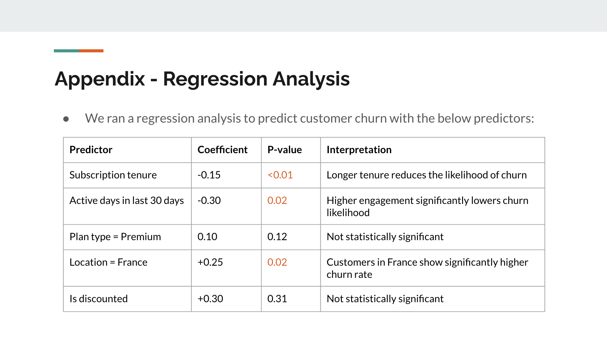
- Important caveats of this project — If there are any important caveats of the project, for example, a certain data point is not available or a dataset is not accessible, you should explain them in the appendix. For example, I would include a slide like this in the appendix to show the detailed result of a regression analysis.
Summary
As a rule of thumb, for a 30-mins presentation (including 5–10 minutes saved for Q&A), your presentation should not exceed 12 slides (excluding the appendix), which include:
- Context: 1–2 slides
- Key insights and recommendations: 1–2 slides
- Detailed analysis: 5–7 slides
- Summary: 1–2 slides
And of course, presentation is more than preparing a well-structured deck. Here are some bonus tips for those who have made it this far:
- Rehearse your presentation: If you are not confident enough with your presentation skills or you have an upcoming presentation with senior leadership, it is always a good idea to rehearse your presentation. You should get yourself 100% familiar with the content on each slide, and practice your flow, tone, pace, and timing. The more you practice, the more natural your presentation will be. You can also ask your manager or teammates for feedback.
- Maintain eye contact: During the presentation, be sure to engage your audience by maintaining eye contact with them, especially when you are delivering your key points. This helps you evaluate if they resonate with your message or if they need any clarification on certain topics. It also makes your presentation more persuasive.
- Handle Q&A strategically: Q&A can be stressful. Though I said above that you could anticipate some questions and prepare answers in the appendix, there will always be unexpected questions coming up. When that happens, if you have any ideas in mind, don’t be shy and share your thoughts confidently. Meanwhile, it is also totally okay to admit when you don’t know — you can always say “That’s a great question. I will look into it further and follow up with you.”
A successful presentation is the key to converting your data insights into real business impact. I hope you have found the above advice helpful and feel more confident in your presentation skills.


