
Evaluating ChatGPT’s Data Analysis Improvements: Interactive Tables and Charts
Is ChatGPT becoming a BI tool?
Context
In May 2024, alongside the exciting release of the GPT-4o, OpenAI announced its improvements to data analysis in ChatGPT, featuring interactive tables and charts, and integration with Google Drive and Microsoft OneDrive.
In this article, I will evaluate these new features and envision the future of data analysis with ChatGPT.
A Brief History of Data Analysis with ChatGPT
ChatGPT’s journey into data analysis began with the introduction of the code interpreter in March 2023, which was rolled out to Plus users in July 2023.
Later, OpenAI rebranded it to Advanced Data Analysis, then Data Analysis, and now Data Analyst, as one of the official GPTs. Today, you can use this standalone Data Analyst GPT or prompt ChatGPT directly to perform data analysis functions.
OpenAI has been continuously improving these features. Notably, it announced improvements to data analysis in ChatGPT in May 2024, enhancing the ability to interact with tables and charts. Here you can find their most up-to-date help center article: Data analysis with ChatGPT.
Evaluating Recent ChatGPT Data Analysis Enhancement
In my previous article Evaluating ChatGPT in Data Science: Churn Prediction Analysis as an Example, I ran through a real-world data science use case with ChatGPT. Although it provided quick and logical analysis, I concluded that ChatGPT wasn’t ready to replace skilled data scientists due to gaps in data preparation, data science expertise, and business knowledge.
In this section, I will evaluate the latest features: interacting with tables and charts in ChatGPT.
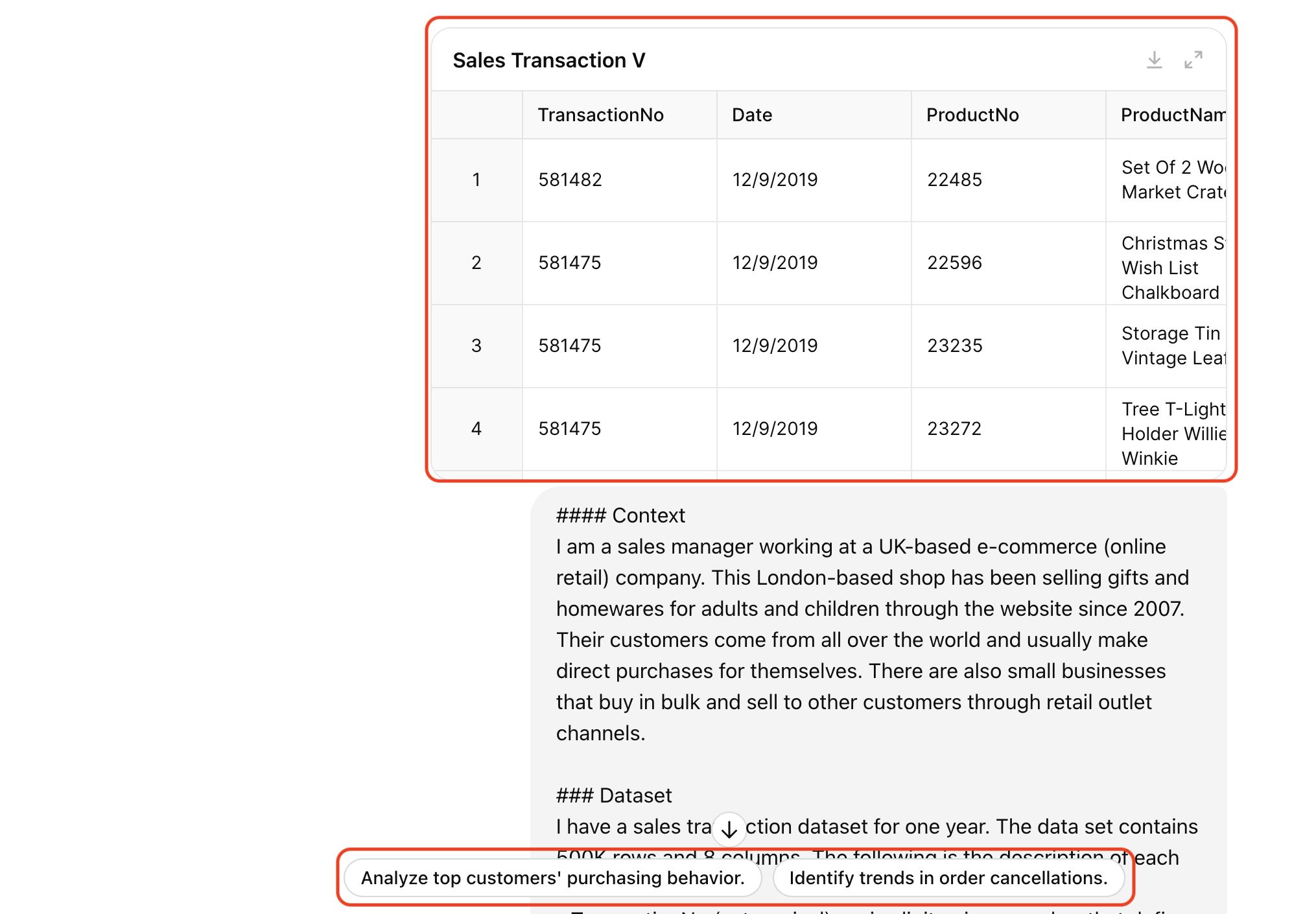
1.Loading and Previewing the Dataset
Let’s start with a practical example. I’ll use a dataset of transactions from an e-commerce company on Kaggle. Suppose I am a sales manager seeking to analyze this dataset to identify sales growth opportunities. Here’s my prompt:
### Context
I am a sales manager working at a UK-based e-commerce (online retail) company.
This London-based shop has been selling gifts and homewares for adults and children through the website since 2007.
Their customers come from all over the world and usually make direct purchases for themselves.
There are also small businesses that buy in bulk and sell to other customers through retail outlet channels.
### Dataset
I have a sales transaction dataset for one year.
The data set contains 500K rows and 8 columns.
The following is the description of each column.
- TransactionNo (categorical): a six-digit unique number that defines each transaction. The letter "C" in the code indicates a cancellation.
- Date (numeric): the date when each transaction was generated.
- ProductNo (categorical): a five or six-digit unique character used to identify a specific product.
- Product (categorical): product/item name.
- Price (numeric): the price of each product per unit in pound sterling (£).
- Quantity (numeric): the quantity of each product per transaction. Negative values related to cancelled transactions.
- CustomerNo (categorical): a five-digit unique number that defines each customer.
- Country (categorical): name of the country where the customer resides.
There is a small percentage of order cancellations in the data set.
Most of these cancellations were due to out-of-stock conditions on some products.
Under this situation, customers tend to cancel an order as they want all products delivered all at once.
### Objective
My goal is to use this dataset to gain insights and develop sales strategy to drive sales growth.
You are assisting me in analyzing this dataset today.
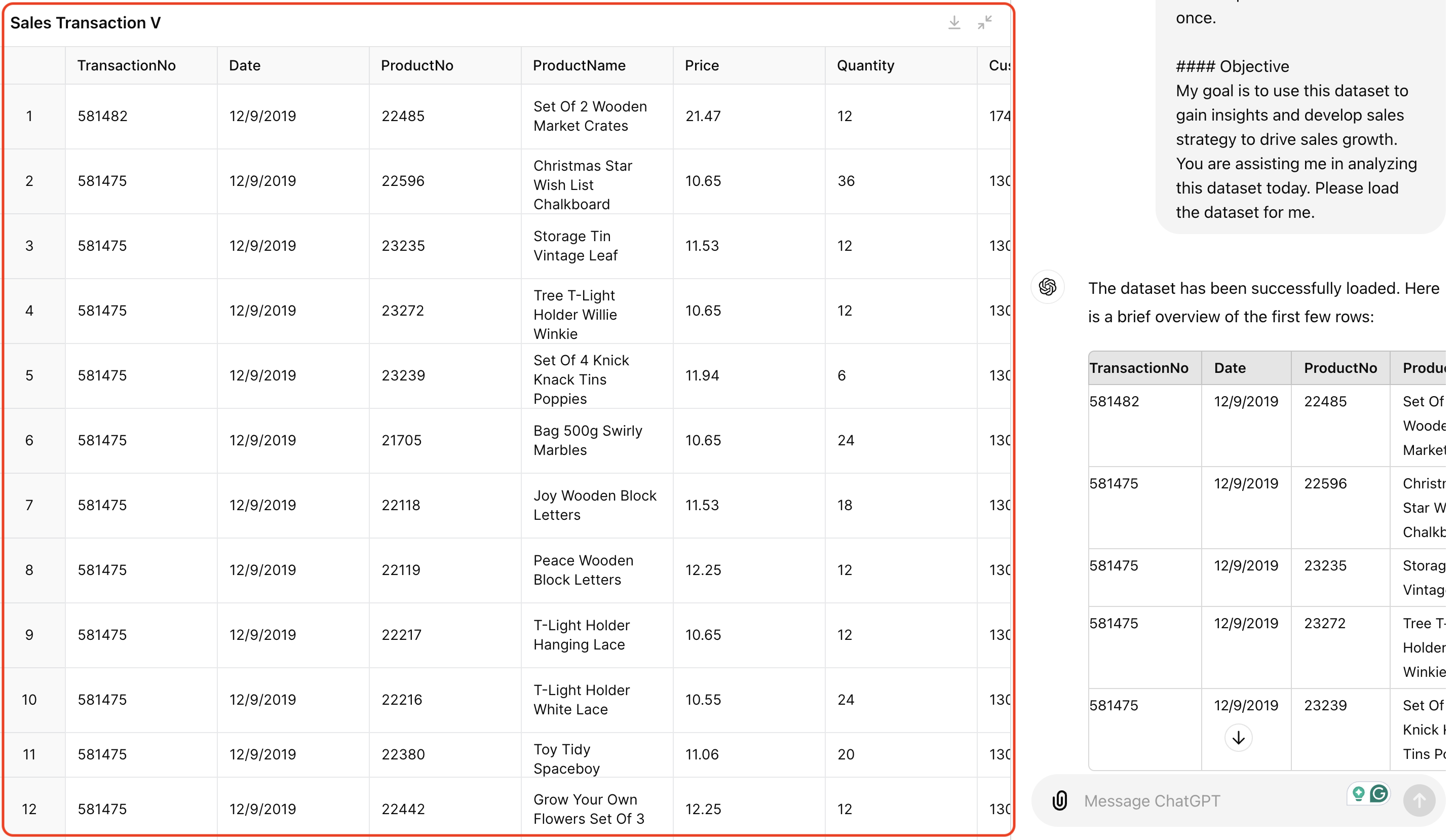
Please load the dataset for me.
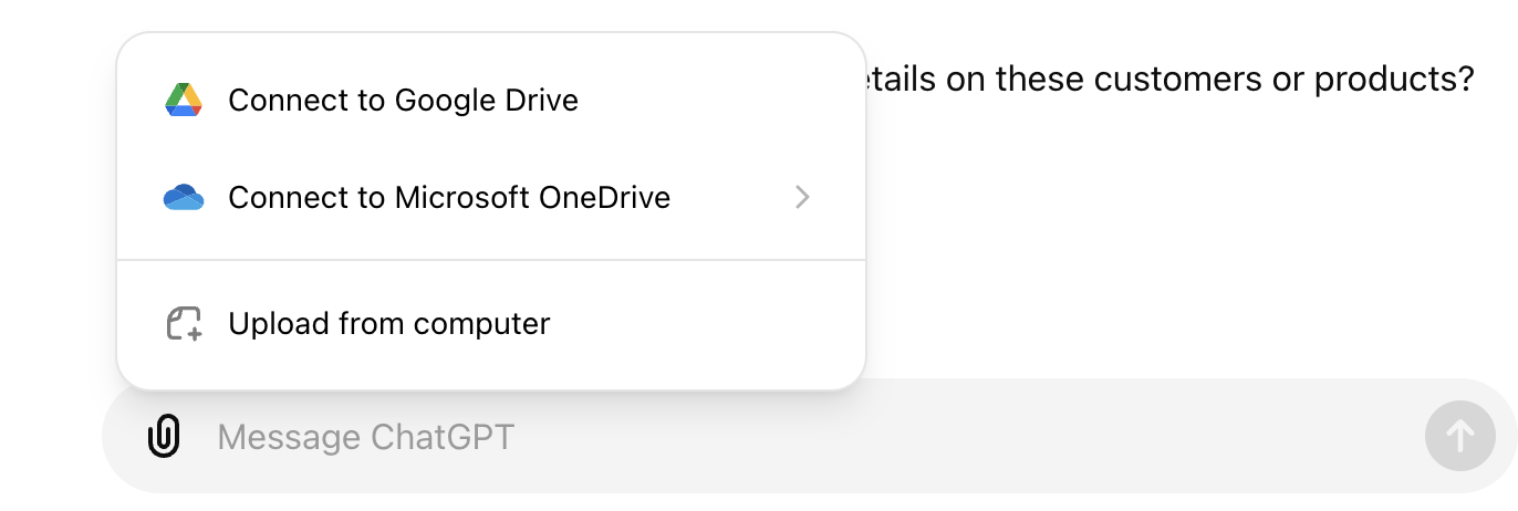
Previously, uploading a dataset to ChatGPT would display just a file icon. But now, ChatGPT creates an interactive table that you can expand to a full-screen view for a closer look at the data. It also offers suggested prompts to guide you deeper into the data.
Additionally, you can now upload data files to ChatGPT from Google Drive or Microsoft OneDrive, making file management and sharing easier, especially for team or enterprise users.
2.Generating and Customizing Visualization
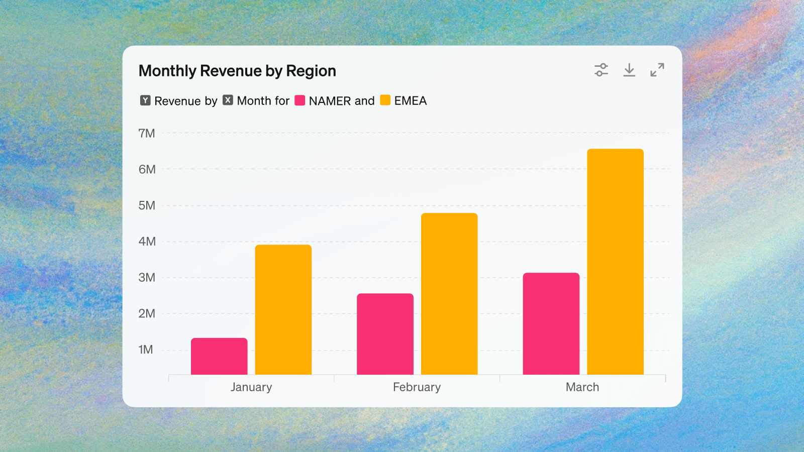
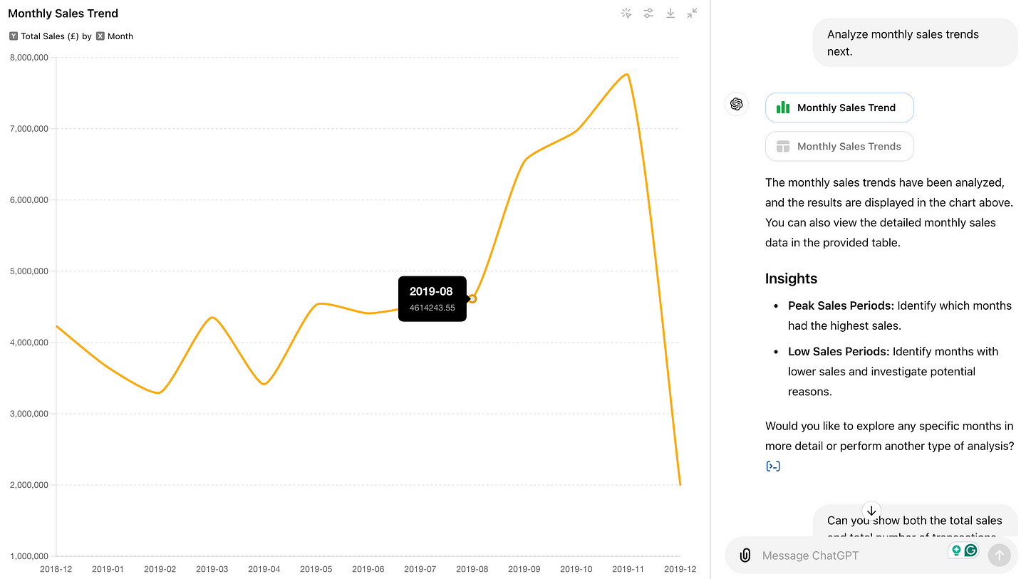
Next, let’s ask an easy but important question: “Analyze monthly sales trends.” ChatGPT generated a simple line chart that I could expand and interact with.
Firstly, when you hover over the points, it shows the values in a tooltip.
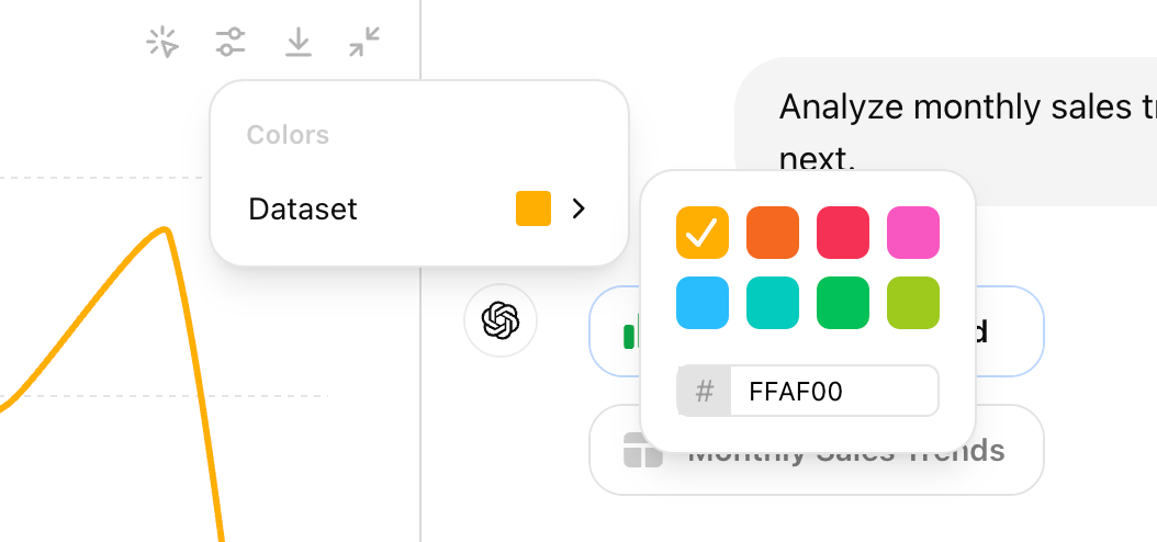
Secondly, You can change the line color by clicking the setting icon on the upper right, and download the chart in PNG format easily with your preferred color scheme.
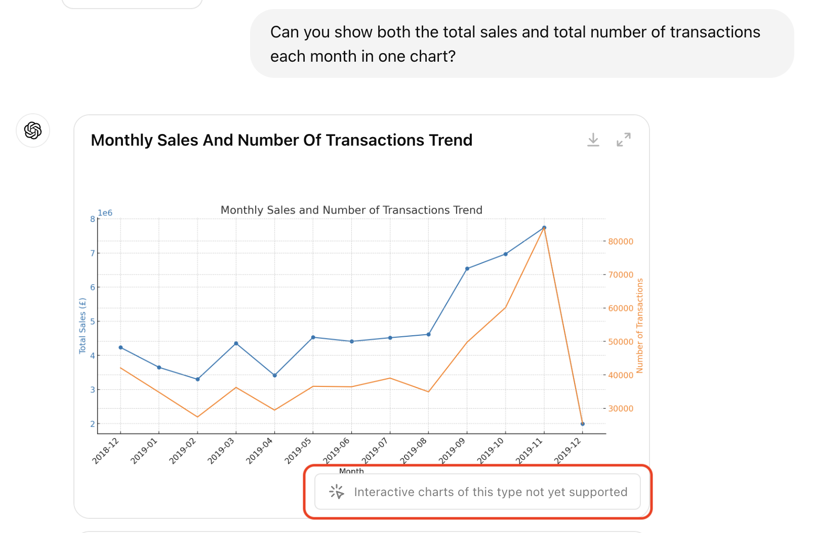
However, not all visualization types are supported. For instance, I asked ChatGPT to plot both monthly sales and the number of transactions in one chart. It generated the chart correctly, but not in an interactive format.
According to OpenAI’s help center article,
“Currently, only bar, pie, scatter, and line charts are currently interactive in most cases. ChatGPT can produce a variety of non-interactive charts, including: histograms, scatter plot, box plots (Box-and-Whisker Plots), heat maps, area charts, radar charts, treemaps, bubble charts, and waterfall charts.”
Even though line charts are listed as a supported type, the more complex or nuanced line charts (e.g. with two axes) remain static.
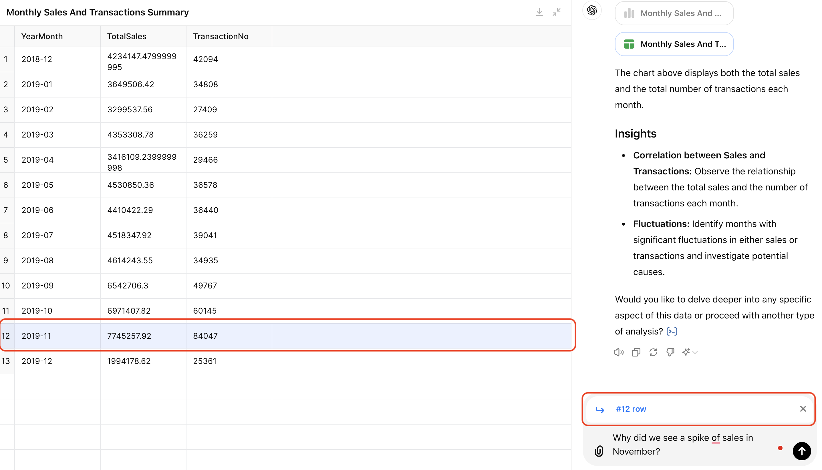
3.Observing and Referencing Tables
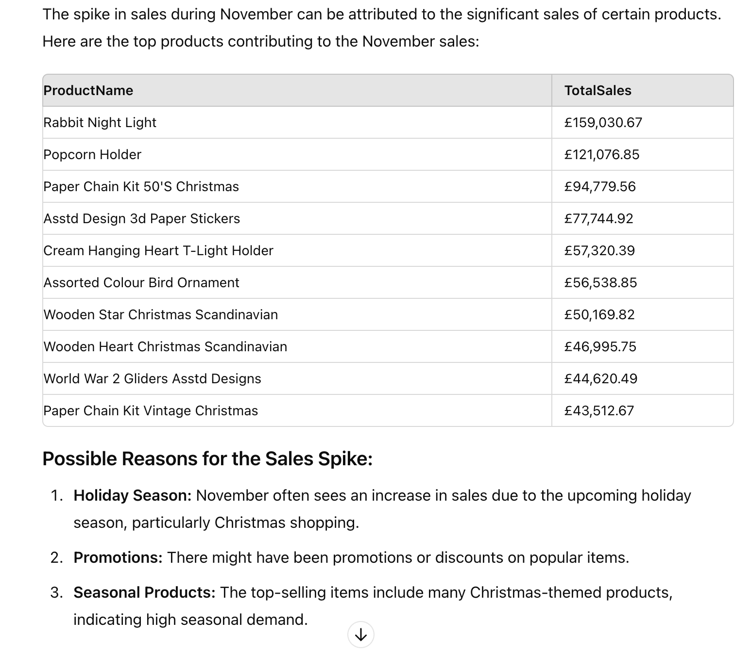
Now let’s try interacting with tables. I expanded the monthly sales and transaction table ChatGPT calculated, clicked on row 12, and asked ChatGPT to investigate the sales spike in November. This is a common data question when we review business metrics. You can see “#12 row” is referenced in the chat, helping ChatGPT to understand the context. It responded reasonably with a list of top products sold in November and its assumptions of the spike.
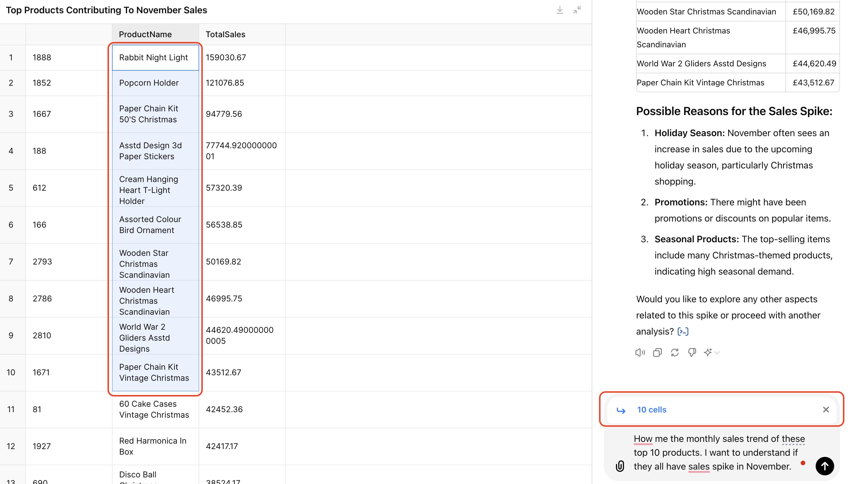
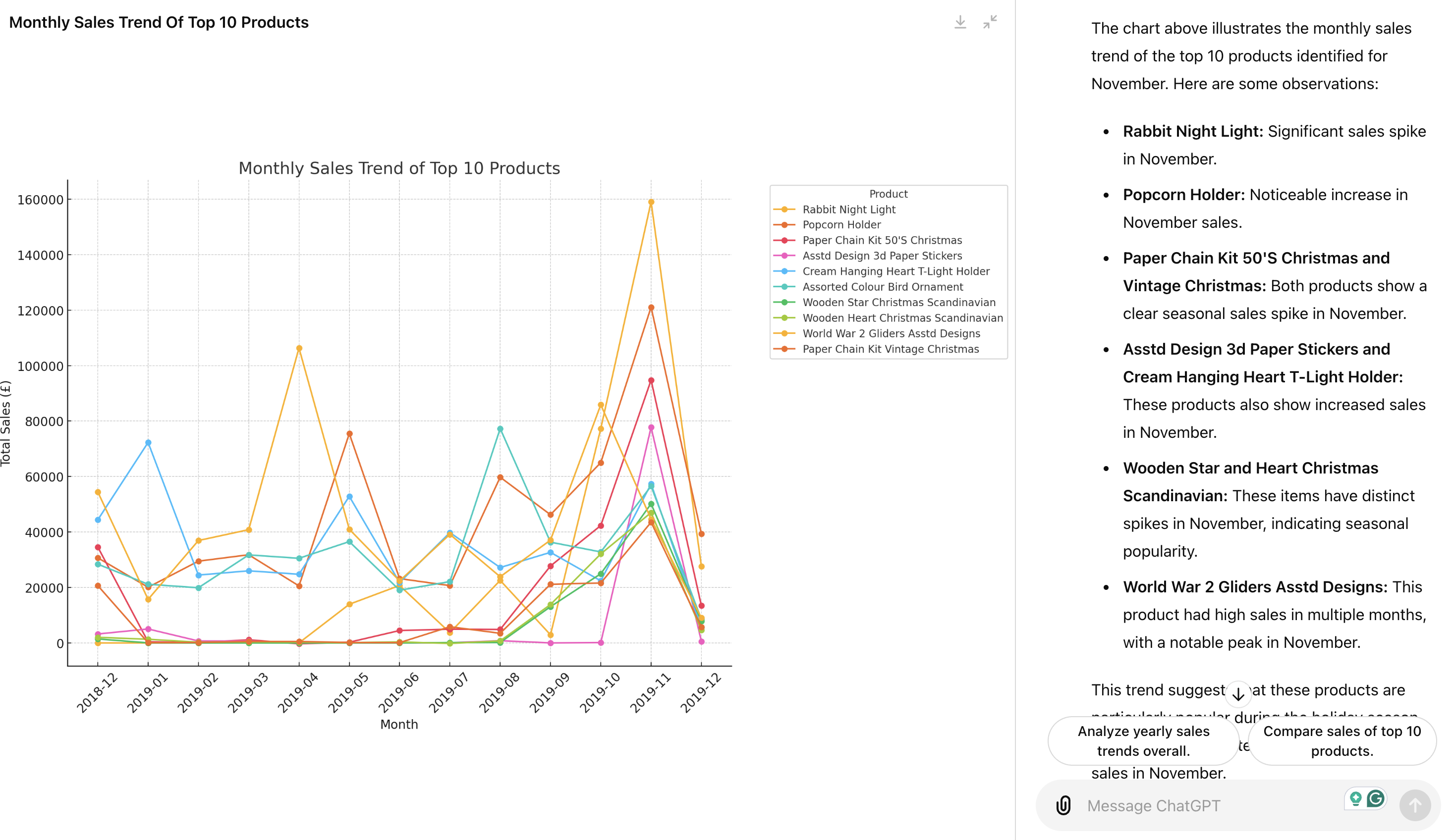
You can also select a group of cells. For example, I selected the top 10 products and asked ChatGPT to show their monthly sales trend to see if they all had sales spikes in November. ChatGPT captured the list of 10 products and provided their monthly trend with insights.
Use Cases of Interactive Tables and Charts
We tested the new capabilities of interacting with tables and charts in ChatGPT above. In my opinion, this update mainly targets non-data professionals, lowering their barrier to data analysis.
- Efficiency: Users can now explore data in a more Excel-like manner using interactive tables but with 10x efficiency. In my example, creating a chart of monthly sales trends in Excel requires several steps - creating a new column calculating sales (Quantity x Price), pivoting the table to calculate total sales by month, and generating the line chart. But now, you can do it by simply talking to ChatGPT.
- Guided Analysis: The suggested prompts act as a data analysis assistant, guiding users to explore data deeper when they are unsure where to move next.
- Presentation-Ready Visuals: The ability to customize visualizations makes it easier for non-technical stakeholders to prepare presentation-ready data evidence supporting their business decisions.
Where is ChatGPT Data Analysis Heading?
So what do you feel about these updates? Honestly, despite the advancements, I found the current interactions somewhat limited, feeling like an MVP for future updates. Reading between the lines, I have a feeling that OpenAI is aiming for something ambitious. Here is my wild guess: OpenAI might be building a conversation-based Business Intelligence (BI) tool.
Here are some clues:
- Product Evolution: The foundational work of recognizing when to output an interactive table/chart is done, and expanding these capabilities is the next logical step. I would be surprised if they just stopped here, and said, “Yes the color of the line/bar is the only thing you can change.” 😂 Inspired by what they currently offer, I wish ChatGPT supported more interactive chart types; I wish I could customize the charts further (the title, axis label, legend, etc); I wish I could select a data point directly on the chart and reference it in the chat to ask questions and conduct deep dive analysis; I wish I could format table cells directly… After writing out all these ideas, I realized I am envisioning a BI tool!
- Target Use Cases: In the “How data analysis works in ChatGPT” paragraph of the new release page, OpenAI says “This makes it easier for beginners to perform in-depth analyses and saves experts time on routine data-cleaning tasks.” Therefore, their current target use cases are data cleaning and initial exploratory data analysis (EDA), which are heavily supported by BI tools like Looker and Tableau (and of course Excel). This suggests a potential step into the BI field.
- Target Users: The new features benefit business stakeholders who aren’t data experts but need basic data exploration or presentation-ready charts. Every data team dreams of making their business stakeholders self-servable. The stakeholders’ interactions with data today typically involve BI tools for exploring datasets and creating visualizations and dashboards. However, their main challenges are understanding the data correctly and exploring the data in the right way to answer their business questions. These are the strengths of ChatGPT and give it an edge over existing BI tools.
- Feature Name Changes: I might be over-interpreting, but it is interesting how they renamed this feature multiple times (Code Interpreter -> Advanced Data Analysis -> Data Analysis/Data Analyst). This progression indicates a shift in focus as they look for product-market fit and potential monetization opportunities. Here is my theory: Initially, they separated “Advanced Data Analysis” from “Code Interpreter” when they identified the potential of AI-based data science. Later, they realized making it more “advanced” in data science is challenging, but there is a broader market need for a chatbot that functions as a data analyst, assisting with daily data exploration and reporting. So what does a data analyst do? Today, they spend much of their time building dashboards in BI tools for metrics reporting and monitoring for stakeholders. Therefore, to make ChatGPT a data analyst, expanding its BI functions makes sense.
Challenges to Serve as a BI Tool
But of course, building a fully functional BI tool out of ChatGPT comes with several challenges:
- Accuracy: We all know that ChatGPT makes mistakes. However, in a business context, especially for business users with little data knowledge, it is critical to provide accurate and credible information. In the example above, to calculate the monthly sales amount, I had to ask it to create a new column of Sales = Price x Quantityfirst. When I asked it to plot monthly sales trends directly, it sometimes summed up the Price column, and sometimes added up the Quantity column. While I was able to spot the issue and correct it with the additional step, you cannot always expect stakeholders to do so.
- Stability: ChatGPT’s output can be inconsistent. I found it confusing when ChatGPT outputs an interactive chart/table vs. a static one… To make the above screenshots, I had at least six threads with ChatGPT on the same dataset with different prompts. Data Size Limitation: According to the help center article, “Up to 10 files can be uploaded to a given conversation” and the file size limit is “512 MB per file. For CSV files or spreadsheets, the file size cannot exceed approximately 50MB, depending on the size of each row.” Real-world datasets can easily exceed this size limit.
- Short sessions: When I returned to yesterday’s chat, I could no longer view the table with the error message “Unable to display visualization”. In business settings, the ability to revisit and continue exploring datasets is essential, maybe inspired by a new business idea or want to solve a follow-up question.
Conclusion
In summary, ChatGPT’s recent interactive tables and charts feature target non-data professionals, making data analysis more accessible and efficient. Users can interact with data visually, guided by suggested prompts, and customize visualizations to suit their presentation needs.
This development could even pave the way for a powerful conversation-based BI tool that makes business stakeholders more self-servable in basic data exploration and reporting.