2023 LinkedIn Post Engagement Analysis
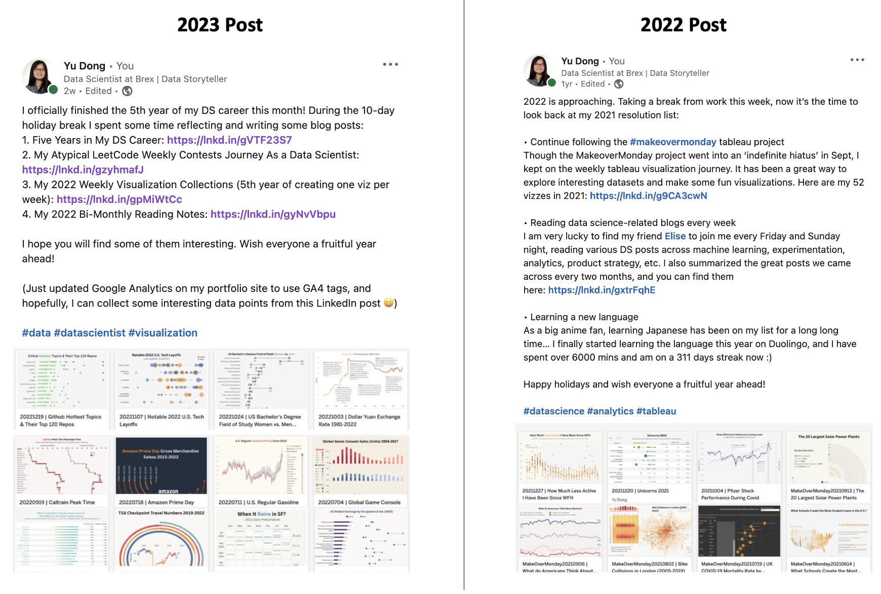
On Jan 2nd this year, I posted my annual reflection on LinkedIn. I am very happy to see some great interactions on the post and as a result, an increase in website traffic to my blog.
As a Data Scientist, I would like to see everything from a data perspective. So today, I collected some data points from LinkedIn and Google Analytics, to quantify the impact of this post, and compare it with the engagement of last year’s post.
LinkedIn Analytics
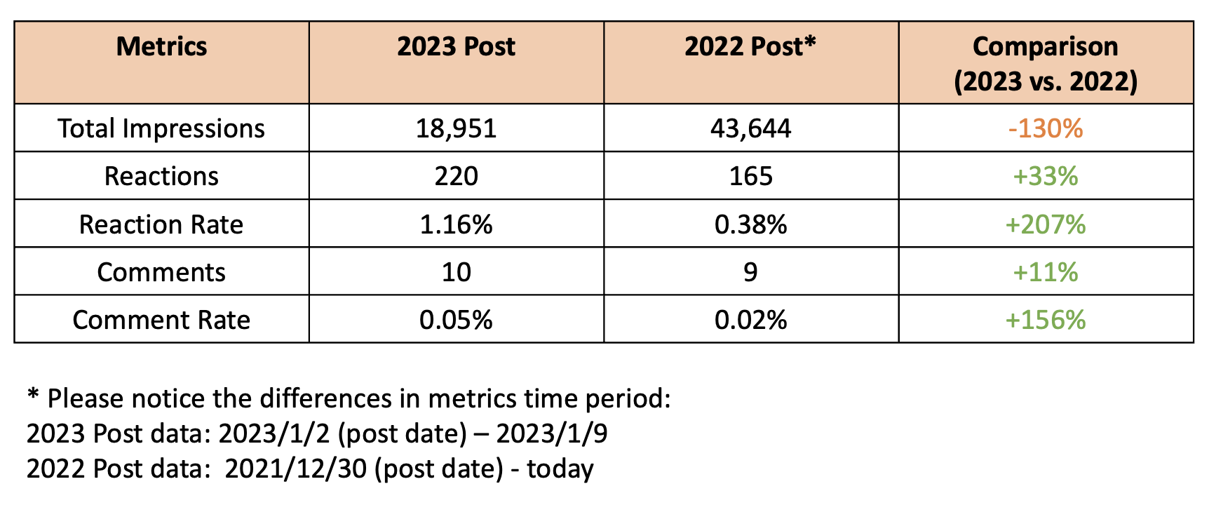
First, let’s look at LinkedIn post engagement. LinkedIn provides very handy analytics on your posts, including impressions, reactions, comments volume, and top demographics of people reached.
Let’s first look at the interaction funnel:
- This year’s post had 19.0k impressions in the first seven days, with a reaction rate of 1.16% and a comment rate of 0.05%;
- Looking back at last year’s post, unfortunately, LinkedIn does not allow me to filter the engagement metrics to a certain time window, so I could only look at its all-time engagement – it has much higher impressions of 43.6k, but in the meantime, the reaction rate is much lower at 0.38%, and comment rate is also lower at 0.02%;
- Obviously, this is not a fair comparison due to the time window differences. As you can imagine, post impressions follow a long-tail distribution. In the first few days, you see the majority of the impressions, with higher interaction (as people who see the posts first are mostly your 1st connections or people who are more active on LinkedIn, so they have a higher likelihood to react), but then impressions go down and increase a little bit every day, with a lower interaction rate;
- However, considering last year’s impressions are over two times higher than this year, but the reaction rate is three times lower, I think it still provides a directional insight that this year’s post got lower impressions but higher interactions;
- This could be a combination of many different factors. Here are some assumptions: First, maybe LinkedIn has improved its recommendation algorithm, and my post now reaches fewer but more relevant audience (Thanks LinkedIn!); Secondly, we all know this year the job market is pretty bad, so this could definitely change how people use LinkedIn; Thirdly, the last post was published on 2021/12/30 (several days before the new year), while this one is on 2023/01/02 (right before the first work day in 2023), so the timing could also make a difference; Lastly, it could simply be my post is more attractive this year :)
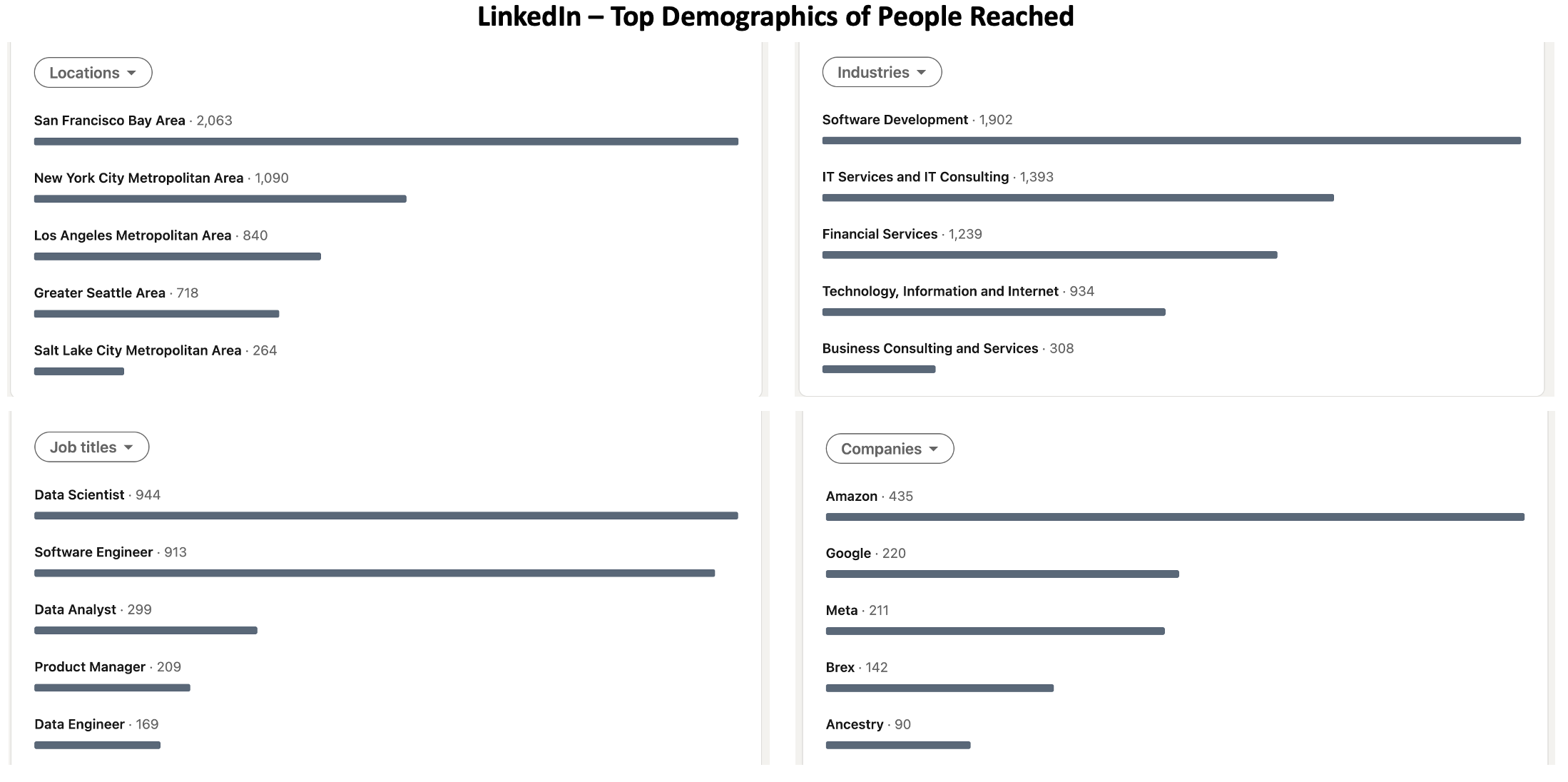
Next, let’s look at the top demographics of people reached. As I myself am a Data Scientist working in the Bay Area, it is no surprise at all to see most of these demographics.
- Location-wise, we see Bay Area at the top, as I have many friends, classmates, and colleagues here, and Bay Area has by far the most tech companies;
- Industry-wise, these industries are definitely the ones where my most connections are in and where have most DS openings;
- As for job titles, of course, Data Scientist is the most common audience, while the other top ones are the people who we DS collaborate with most at work – software engineers, product managers, and data engineers;
- Top companies are interesting though. Amazon, Google, and Meta show up as the top three, I think mainly because they have far more employees (especially DS) than other companies lol. And the other two on the list are my previous and current employers, which makes a lot of sense…
Google Analytics
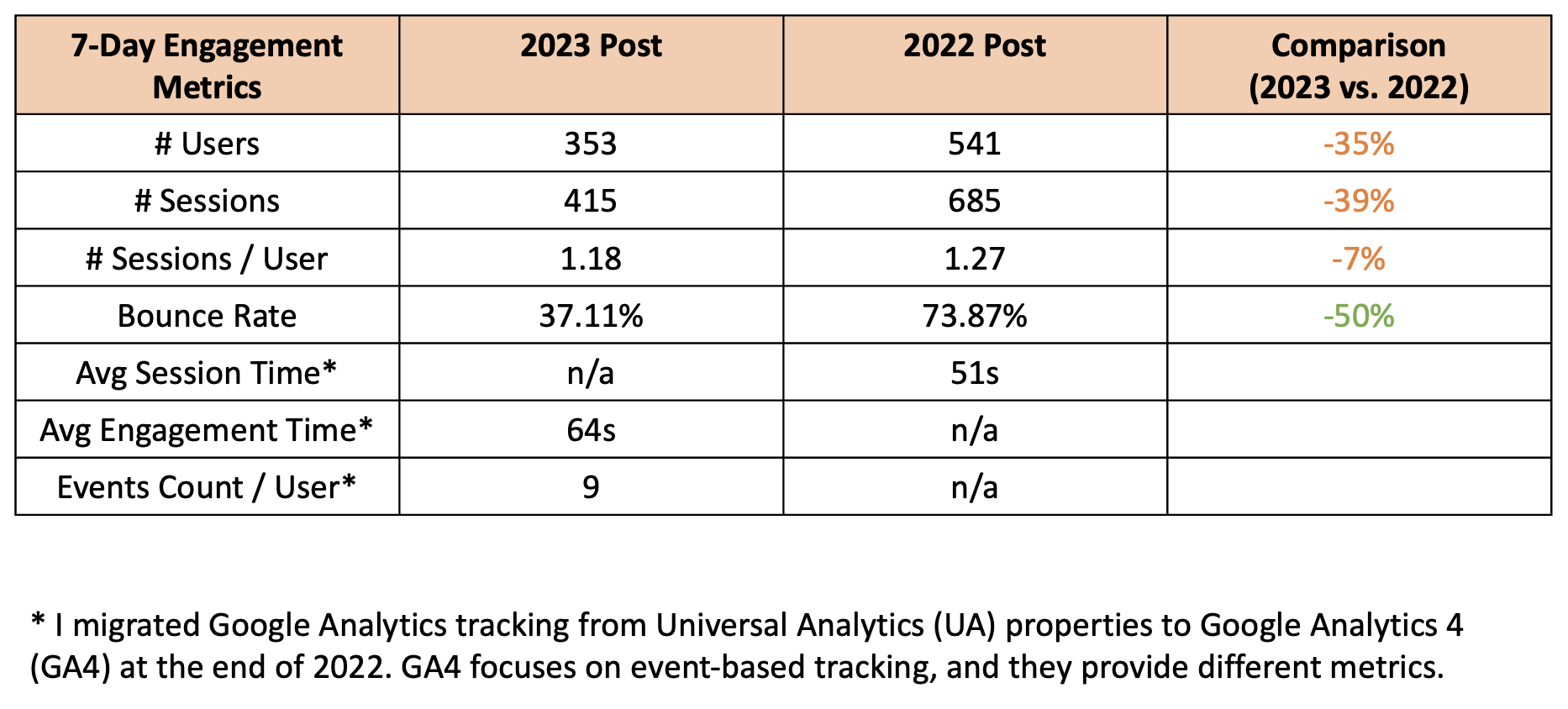
Now that we have looked at the engagement metrics on LinkedIn, let’s see how they translated into web traffic to my blog site. Below is a 7-day engagement summary on my Google Analytics dashboard.
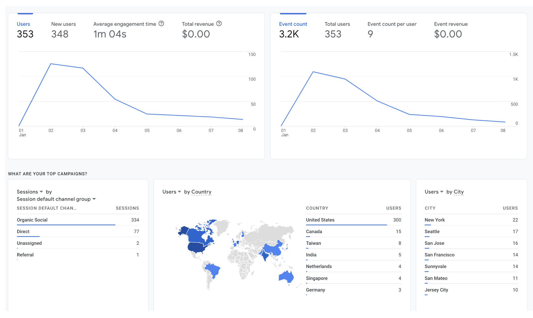
I always have Google Analytics set up on my website. However, I migrated from Universal Analytics (UA) properties to Google Analytics 4 (GA4) properties right before this year’s post, as Google is sunsetting UA soon. Here is an article explaining the differences between the two – essentially, GA4 focuses on event-based tracking instead of session-based tracking. Therefore, this time although I am able to compare last year’s and this year’s engagement within the same time window (7 days after the post day), the tracking properties and metrics are slightly different.
So let’s look at the YoY comparison while keeping the nuances in mind:
- We see fewer users and sessions this year (35% fewer users and 39% fewer sessions), which is expected as the upper funnel impressions in LinkedIn are lower. But given the impression is 130% lower (again, in a different time window), but the user count is only 35% lower, I highly suspect the website traffic conversion is actually higher this year, just as the reaction rate;
- However, I am very excited to see the bounce rate reduced from 74% to 37%, that’s cut in half! Thinking about potential reasons for this much higher bounce rate – Firstly, as I mentioned above, this year the LinkedIn post has a higher reaction rate, so that could mean a better-targeted audience and thus higher interest in my blog content; Secondly, in last year’s post, I only had two URLs linking to my weekly viz and bi-monthly reading notes, however, in this year’s post, there are four different contents promoted, so it could arouse more interests and making the audience browsing more on my site; Lastly, I also improved my website UI a little bit, for example, adding quick links under my bio picture, so it could make it easier to navigate on the site;
- There are some other engagement metrics like average engagement time and events per user – although they are not available last year, it is good to see people on average engage over one minute.
As I played with all sorts of reports on Google Analytics, the next interesting report I would like to show is the page-level performance. Here are two tables, the left one being the engagement metrics by the landing page, while the right one showing overall page performance.
- Most visitors land on the five-year reflection article, which not necessarily mean it is the most attractive one, as it is the first URL on the post… This page is also the most viewed page overall with the longest engagement time (well, it is the longest post as well). However, it also appears to have the highest bounce rate.
- On the other side, out of the four pages directly linked in the post, the landing page with the lowest bounce rate is the bi-weekly reading notes category page. I linked the bi-monthly posts to the category page under the reading-notes tag directly. This means I added an extra step to the actual post manually, so it makes total sense that this page as a landing page has a lower bounce rate. And as it is simply a list of posts, this page also has a very low engagement time.
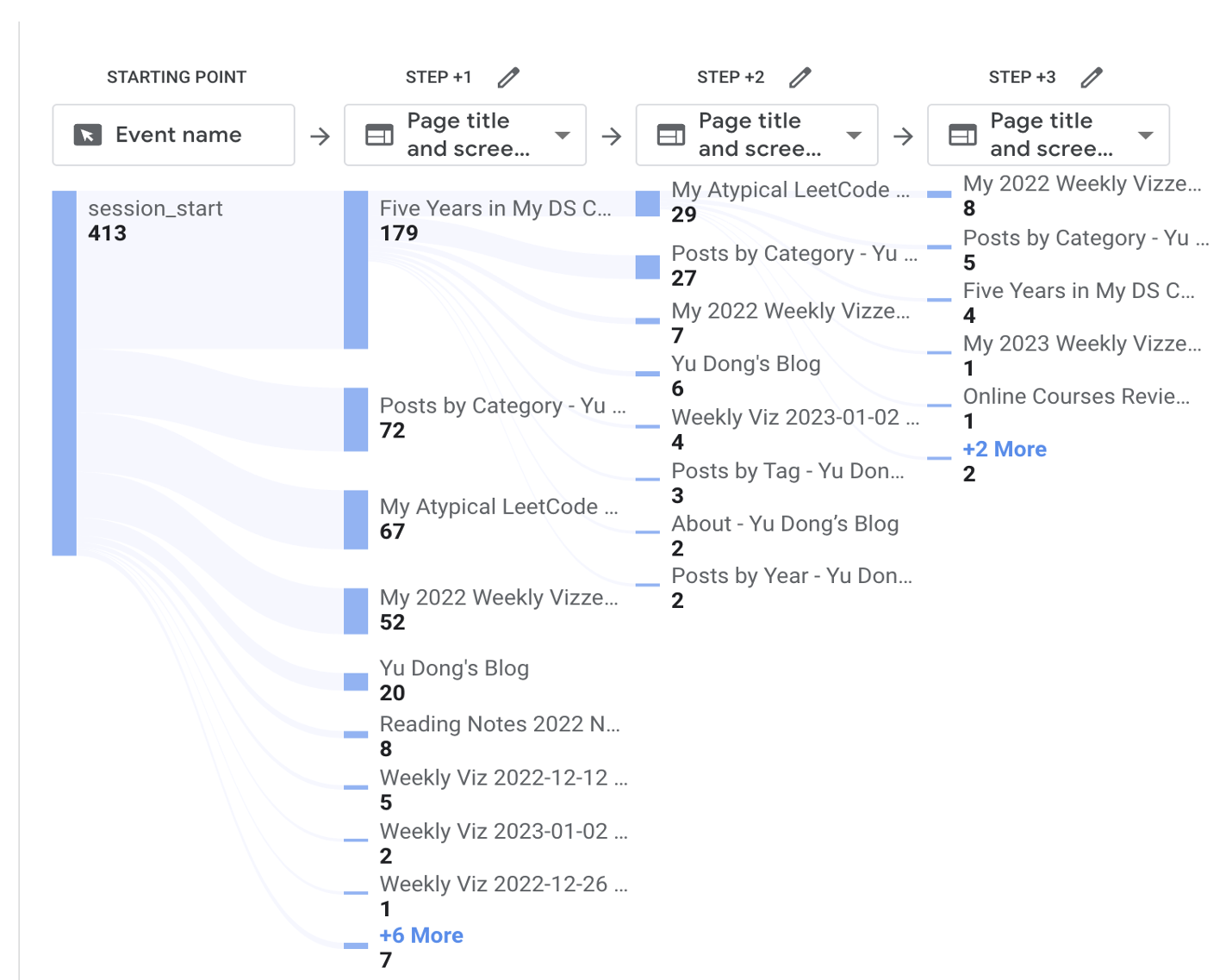
- You can also find the page path exploration below, which shows some common visitor paths.

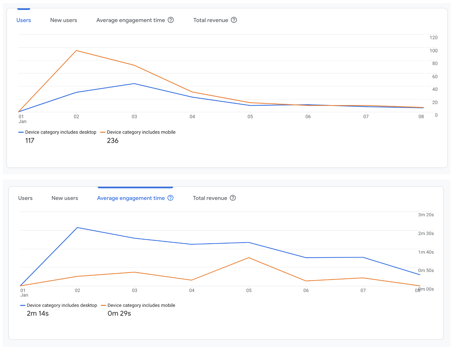
The last metric I would like to show is the comparison of engagement by the device.
- 67% of the users were on mobile devices, which I assume correspond with LinkedIn device usage preferences. However, the traffic difference is mostly seen in the first three days, but afterwards the users from desktop and mobile are almost the same – one assumption is people returning on desktop devices as my website definitely works better (especially the visualization posts) on desktop;
- We also see website users have 3.6x higher average engagement time than mobile users, again I believe it’s because of better user experience on desktop…
Summary
- This year, I see lower impressions but higher reaction rates from my LinkedIn post, which could be due to LinkedIn recommendation algorithm updates, changes in the macroenvironment, post timing differences, and improvement in my post quality;
- Website visits are also lower than last year due to upper funnel LinkedIn impression decreases, but bounce rate improved by 50%, potentially related to better targeted LinkedIn audience, more contents in the LinkedIn post, and better website UI;
- The most common landing page is the five year reflection, which also happens to be the first URL in the Linkedin post; In the meantime, the landing page with the lowest bounce rate is the bi-monthly post category page, as it adds an extra step to view the actual post;
- Two-thirds of the users are from mobile devices, but desktop users show 4.6x average engagement time, which could be due to a better website experience on desktop.
Next Steps
So, what can we learn here? Due to the various changing factors, it is still hard to explain many of the changes we see above. But it does seem like more diverse content in the post and better website UI help with user engagement (and actionable for me), so I will keep up with that in next year’s post.
I hope you enjoy this small analysis :)


