
330 Weeks of Data Visualizations: My Journey and Key Takeaways
How consistent practice in data visualization enhanced my data science skills
I have been making one visualization weekly since I started my full-time data science job in 2018. Now, over 330 weeks later, I consider this an achievement I’m truly proud of. During coffee chats, people often ask me about it, which inspired me to write this article and share my journey and key takeaways.
I will cover how I got started, how to find datasets for visualization, how to choose the right visualization tools, what I’ve learned, and tips for aspiring data visualizers.
How Did I Get Started
When I began my first full-time job, my mentor, a Tableau guru, introduced me to the MakeOverMonday project.
Welcome to Makeover Monday! Makeover Monday is your weekly learning and development appointment with yourself and hundreds of passionate data people. For free! Join us every Monday to work with a given data set and create better, more effective visualizations and help us make information more accessible. The Makeover Monday community comes together every week from around the globe and we would love for YOU to become part of it, too.
It’s an amazing community, and I can’t recommend it enough if you’re looking for Tableau data visualization inspiration.
Since then, I’ve dedicated one hour every Monday to visualizing the dataset posted on MakeOverMonday. I publish my visualizations on Tableau Public and write a short blog post with data insights.
How to Find Datasets to Visualize
Initially, I followed the datasets posted weekly by MakeOverMonday. However, the project paused for a year in September 2021. Running the community weekly is a huge commitment, so I completely understand the need for a break. Starting in October 2021, I began finding my own datasets to visualize every week.
I soon realized finding a “visualizable” dataset each week can be challenging. Sometimes, I spend more than an hour searching for a dataset but only 15 minutes creating the actual visualization - I try to limit the actual visualization time to be within 30 minutes to make it more sustainable. Here are some approaches I adopted to find datasets:
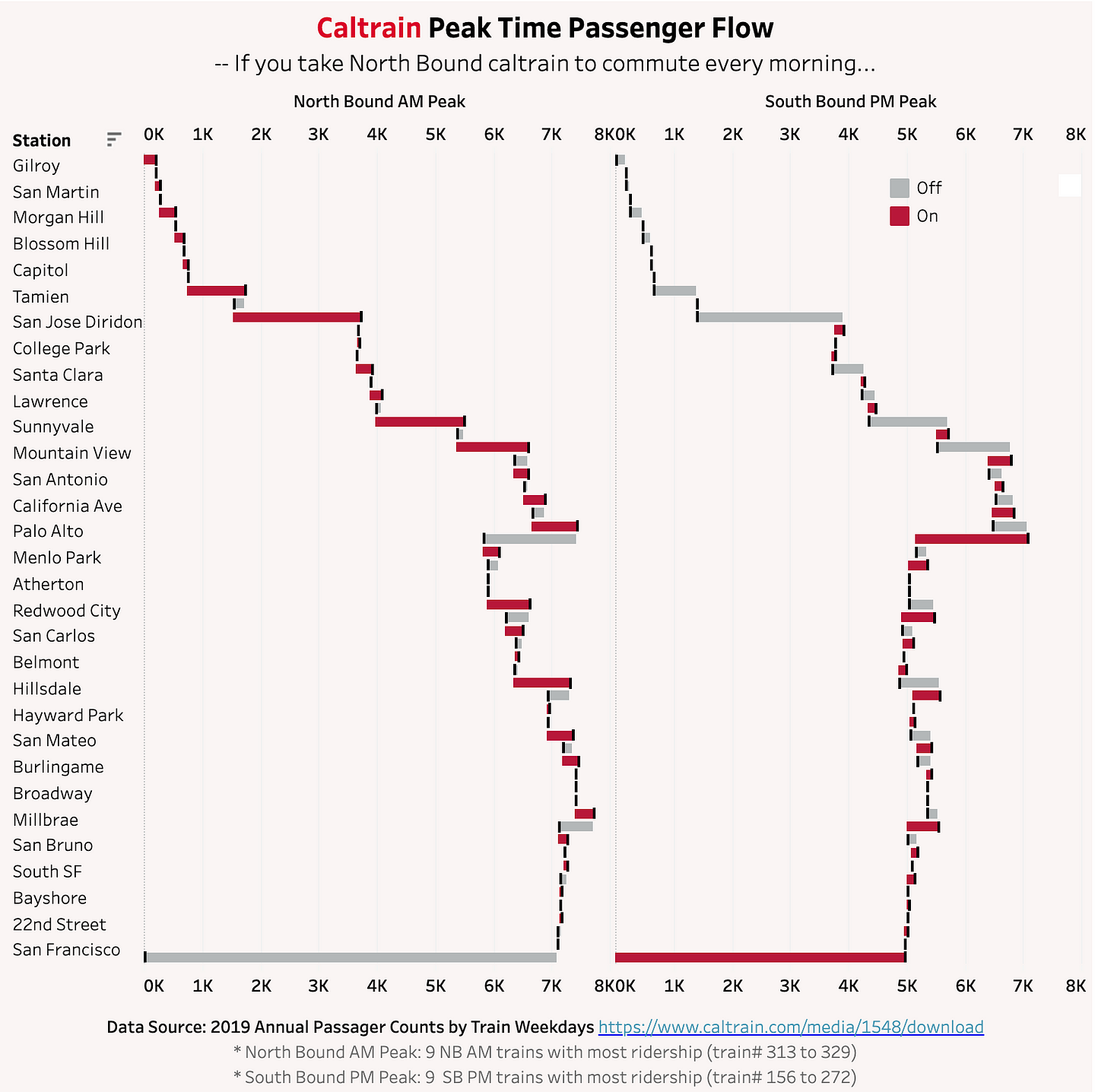
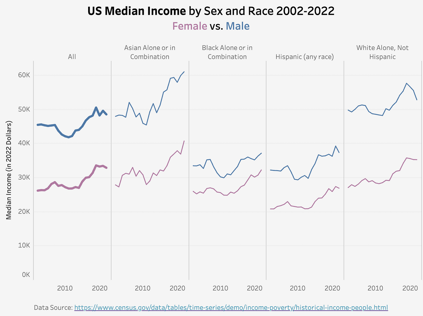
1.Datasets related to my personal interests or experiences: My visualization ideas often stem from my interests or experiences. When I have a specific data question in mind, I search for relevant datasets online - data mining is also an important data science skill 🙂. For example, I was curious about the busiest Caltrain stations during peak commute hours, so I found the dataset from Caltrain reports and created this visualization.
2.Visualization newsletters: I subscribe to newsletters like Chartr and Statista, which provide great visualization inspiration and interesting data topics. I enjoy analyzing what makes their visualizations effective and how I might create something different (or better).
3.Kaggle: When I lack ideas, I turn to Kaggle. It offers a wide range of datasets on various topics, and browsing through them often sparks new visualization ideas.
4.Other reliable data sources: Authorities like the US Bureau of Labor Statistics and market research companies like YouGov regularly post high-quality datasets. Many states and cities also have open data portals(for example) with amazing data availability.
5.ChatGPT: I’ve also started asking ChatGPT for visualization ideas. While it’s a great brainstorming partner, it occasionally provides invalid links 😂.
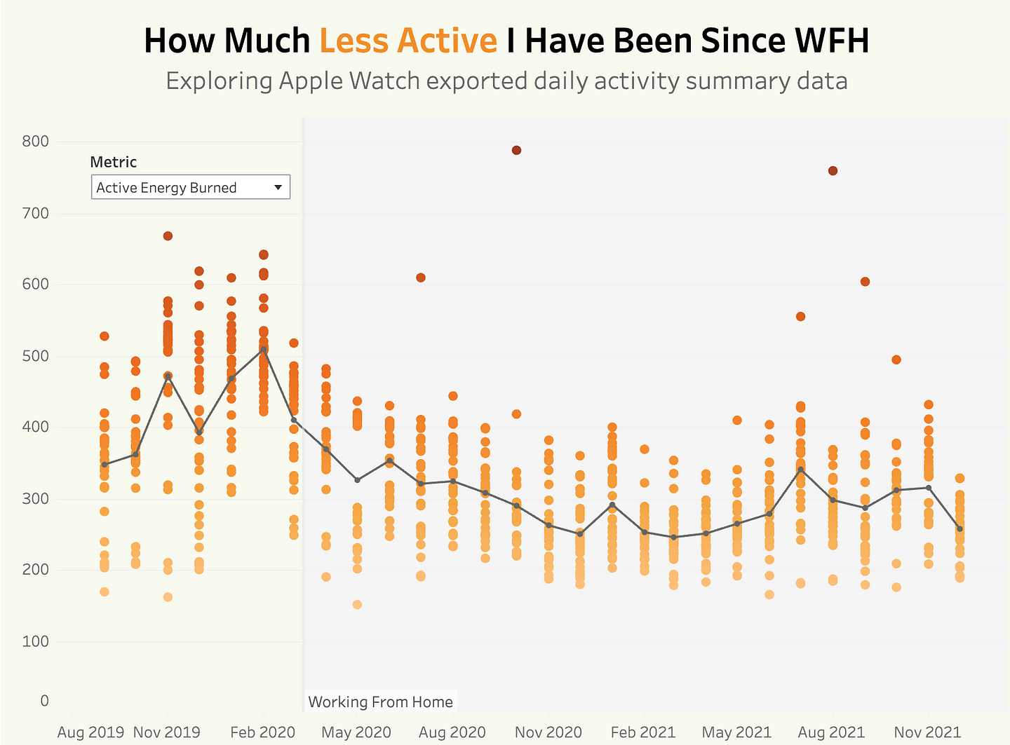
6.My personal data: As a data scientist, I like to collect data on myself. For example, I track my daily spending to better manage my finances. In the chart below, I looked at the health data exported from my Apple Watch, to understand how working from home has impacted my activity level.
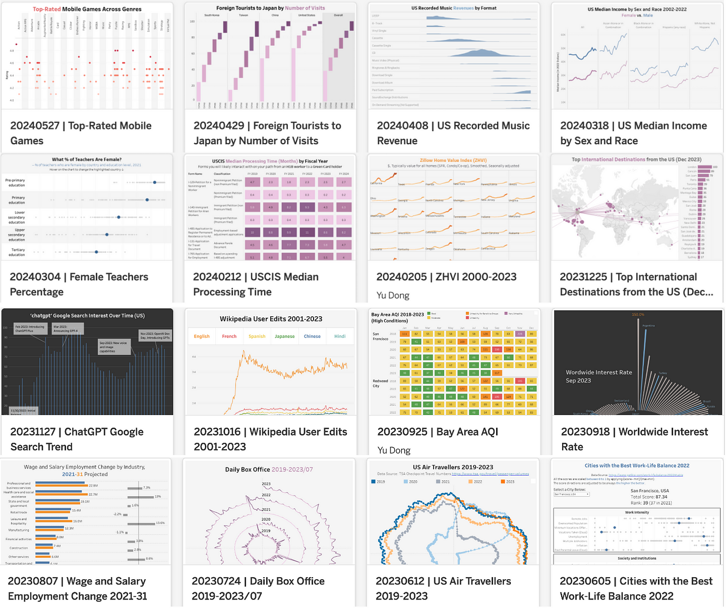
In this article, I created my own dataset from past visualization blogs and analyzed my visualization habits using web scraping techniques and the OpenAI API. If you’re interested in my favorite topics and most-used chart types, check it out.
How to Choose the Visualization Tools
I use Tableau for my weekly visualizations, primarily because I used it for dashboarding and reporting at my first job. However, there are many other options available.
In my opinion, Tableau is the most customizable yet intuitive visualization tool. It’s ideal for creating visually attractive and creative visualizations. I am constantly impressed by the dashboards highlighted in Tableau Viz of the Day. Tableau also has an active community with plenty of tutorials and recommendations. Although enterprise licenses are expensive, Tableau offers a free Desktop App with most of the features needed for personal use. Previously, you could only save visualizations to Tableau Public, which was my biggest complaint about the free app, but the latest version allows local saving.
At my current job, I’ve also used Looker. For personal visualizations, Looker Studio (formerly Google Data Studio) is another good option. Though they have similar names, Looker is an enterprise-level BI tool acquired by Google, while Looker Studio is a free BI tool that started as Google Data Studio and was renamed to Looker Studio. It integrates easily with Google products like Google Sheets and offers a variety of chart types, including the Sankey chart, which can be challenging to create in Tableau. It is also very easy to get started with an intuitive UI (somewhat similar to Excel in my opinion). However, it’s less customizable if you want to fully personalize your visualizations.
Other alternatives include Power BI and more flexible programming packages like Plotly and d3.js. Let me know your favorite visualization tool!
My Data Visualization Milestones
- Week 1(2018–01–08): Started my first weekly visualization with MakeOverMonday.
- Week 100 (2019–11–25): Finished my 100th weekly visualization.
- Week 145 (2020–10–05): Published a Tableau dashboard to visualize the impact of a new work visa policy proposal and posted it on LinkedIn, leading to 543 LinkedIn reactions and 6000+ views to the dashboard.
- Week 197(2021–10–04): Started finding datasets to visualize myself.
- Week 261 (2022–12–31): Finished 5-year streak of my weekly visualization journey and posted my achievement on Linkedin with 24k+ impressions of the post.
- Week 338 (2024–06–17): Still keeping up with this habit today :) My goal is to reach at least the 7-year mark, so I have 365 visualizations to share (that is one per day for a whole year!).
What Have I learned
Keeping up this weekly visualization journey for over 330 weeks has been incredibly rewarding. Here are my key takeaways:
- Learning Best Visualization Practices: The best way to learn is by practicing. Reviewing my visualizations, I can see how my skills have evolved. For instance, I used to cram multiple charts into one visualization, but now I focus on keeping only the most relevant information to tell the story. Joining a community like MakeOverMonday is especially helpful, as you can see how others visualize the same dataset, sparking new ideas.
- Practicing Data Analytics and Storytelling: In my weekly blog posts, I describe the dataset, showcase the visualization, and summarize the insights. This process of forming a data question, finding a dataset, and creating a visualization is foundational to daily data science work, and doing it weekly hones my data storytelling skills.
- Building a Portfolio: Posting weekly visualizations enriches my portfolio, showcasing my data science skills and helping advance my career. I have even had recruiters reach out on LinkedIn after seeing my portfolio site. I am planning to write another post to share tips on building a data science portfolio website. Please stay tuned!
Tips for Aspiring Data Visualizers
Looking back at this journey, here are some tips I would like to share with people who would like to learn more about data visualization:
- Start small: Begin with simple datasets and gradually take on more complex projects.
- Join a community: Engaging with communities like MakeOverMonday can provide inspiration and feedback.
- Follow your interests: Think about the topics you are interested in and try to visualize them to make the process more enjoyable and fulfilling.
- Reflect and iterate: Regularly review your work and look for areas of improvement.
Final Thoughts
This journey of creating weekly visualizations has been an incredible learning experience and a testament to the power of consistency. It has enhanced my skills, broadened my perspective, and connected me with a vibrant community of data enthusiasts. If you’re passionate about data visualization or looking to improve your data storytelling skills, I encourage you to embark on a similar journey. Happy visualizing!