Most Profitable Companies
Most Profitable Companies
About Makeover Monday
MakeoverMonday is a social data project: “Each week we post a link to a chart, and its data, and then you rework the chart. Maybe you retell the story more effectively, or find a new story in the data. We’re curious to see the different approaches you all take. Whether it’s a simple bar chart or an elaborate infographic, we encourage everyone of all skills to partake. Together we can have broader conversations about and with data.”
Starting from Jan 08, 2018, I decided to put aside one hour on Monday weekly to create some visualization and find some insights from the data.
The datasets are published each week at: MakeoverMonday Datasets.
Makeover Monday 0129
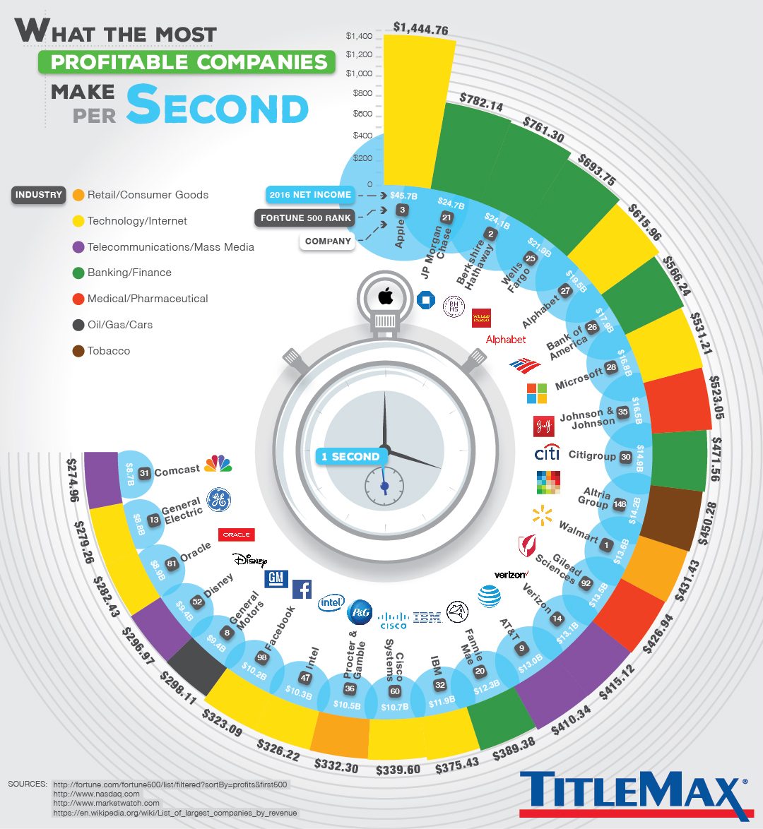
This week’s data is about the top 25 companies with highest net income in 2016. The original discussion could be found in this link.
The original viz is as below. It is a easy to understand and fancy visualization. A very good example.
My Visualization
As the original viz has been a good one, and the data is quite straightforward, I tried to make some interesting viz I have never tried before. Basically, I decided to interpret the data as how well Apple was performing - how many days Apple took to earn the annual net income of other most profitable companies. And I tried to stack the Apple logo instead of the boring bar chart. I spent about 90 minutes on that. A detailed guide to stack custom shapes as bar chart could be found here. Below is my dashboard:
–
Please notice that all the visualizations are designed for desktop view, so it is recommended to view them on a desktop device.
–
Interesting findings
- Considering net income, Apple is really outperforming all the other top companies in 2016. It almost doubles the net income of the 2nd most profitable company (JP Morgan Chase), and its net income in two months almost equals to the annual net income of 25th most profitable company (Comcast).
- High net income will not promise a high fotune 500 ranking, as fortune 500 mainly considers the total annual revenue, and those companies earn less but has a higher profit margin () will win in net income. The companies on the upper left of the bubble chart are those with a high total income but low profit margin.
Follow this link to find more weekly vizzes :)


