
Wikipedia User Edits 2001-2023
Wikipedia User Edits 2001-2023
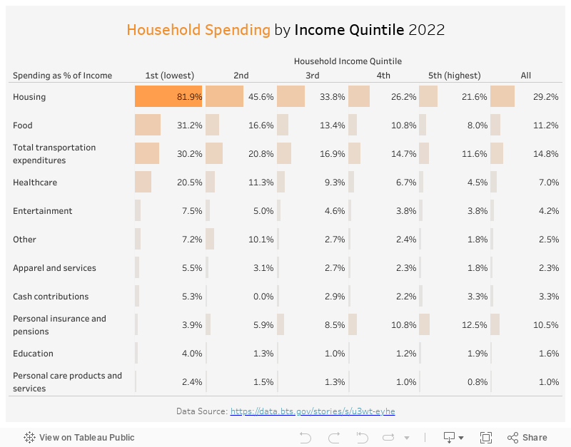
This week, I came across the website of Bureau of Transportation Statistics. It has lots of interesting data points, related to different transportation types. The data I am visualizing this week is a breakdown of spending as % of household income. It highlights how much households in different income quintiles need to spend on transportation and other expenditure categories.
My Visualization
The visualization is a 2-dimension bar chart, making it easy to compare spend by category and by income quintiles.
Please notice that all the visualizations are designed for desktop view, so it is recommended to view them on a desktop device.
Insights
- Across all the income quintiles, housing is always the highest spending category. Sadly, households in the lowest income quintile need to spend 82% of their income on housing;
- Food and transportation are the 2nd and 3rd highest spending categories consistently, but both percentages go down significantly with the increase of income;
- The personal insurance and pensions spending category is the only one that goes up with income, as people start to save for retirement and accident expenses when they have more disposable income.
Follow this link to find more weekly vizzes :)