
My Favorite Visualization Types
My Favorite Visualization Types
This dataset I am visualizing this week is created by myself! It has been a long long time since I started my weekly visualization journey. Initially, I followed the datasets posted every week by makeovermonday.co.uk. However, starting in October 2021, I have been finding my own datasets to visualize every week. It has been 139 visualizations since then, so sometimes I wonder what my favorite data topics and visualization types are. Therefore, I used web scraping techniques and GPT last weekend to extract these info from my past visualization blog posts. You can find more details and analysis here.
My Visualization
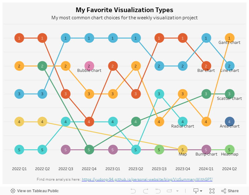
The data point I am visualizing here is the visualization types over time. I used a bump chart to show the ranking shifts quarterly.
Please notice that all the visualizations are designed for desktop view, so it is recommended to view them on a desktop device.
Insights
- It’s not a surprise that line charts and bar charts often appear in the first two places. These are basic, simple, but straightforward ways of visualization.
- Another chart type I used a lot is the Gantt chart (ranked in 1st in the most recent quarter). The Gantt chart is usually used as a project management tool. However, in Tableau, it is a very powerful tool to make plots that do not start from 0. I often use it to show changes or differences between two groups or two time points.
Follow this link to find more weekly vizzes :)