
My Favorite Visualization Topics
My Favorite Visualization Topics
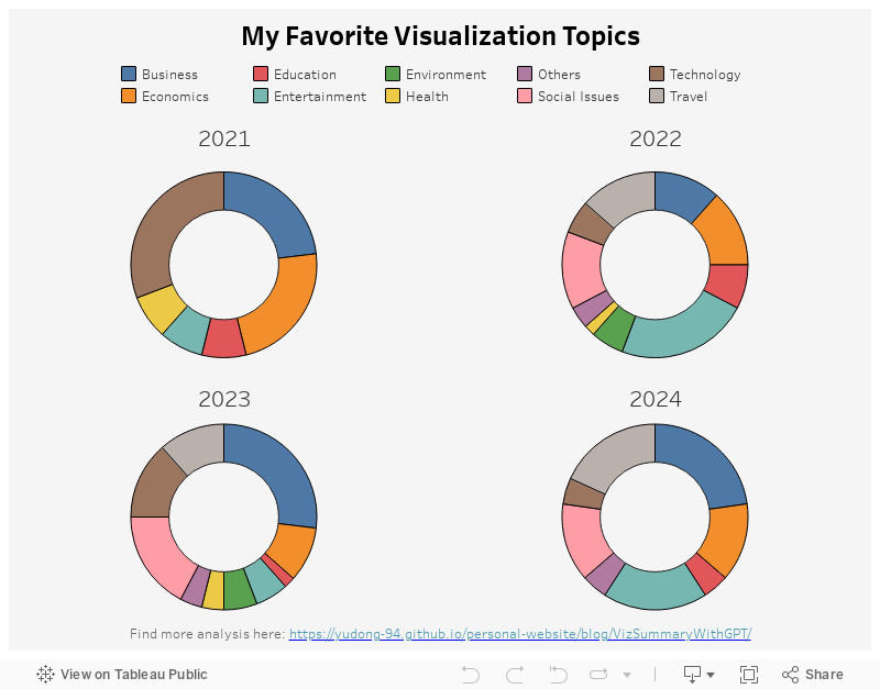
Similar to last week, I am visualizing my weekly visualization dataset! It has the data of 139 weekly visualizations since Oct 2021, which was collected using web scraping techniques and GPT. You can find more details and analysis here.
My Visualization
The data point I am visualizing here is the visualization topics over time. I used donut charts to show the distribution of visualization topics each year, and put them side by side.
Please notice that all the visualizations are designed for desktop view, so it is recommended to view them on a desktop device.
Insights
- Business topics have always been one of my favorite topics – it accounts for about 25% of the visualizations in 2021, 2023 and 2024;
- There is an increasing number of visualizations related to Travel, probably because I am getting more opportunities to travel after the pandemic and that inspired my visualizations.
Follow this link to find more weekly vizzes :)