
US Transportation Habits
US Transportation Habits
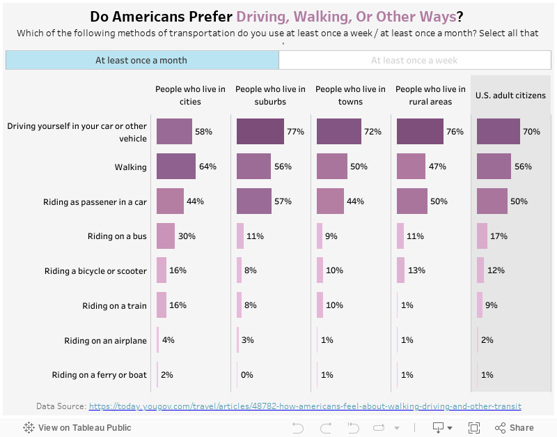
This week I was looking at YouGov for new visualization ideas, and found this interesting report on Americans’ transportation habits. It has multiple insightful data points on frequency of different transportation means, and people’s perception of them.
My Visualization
The data I am visualizing is people’s responses to the question Which of the following methods of transportation do you use at least once a week / at least once a month? Select all that apply.. I plotted it in a grid with different size and color of the bars representing the % of respondents. I also have a filter on the top, where you can switch between “at least once a month” and “at least once a week”.
Please notice that all the visualizations are designed for desktop view, so it is recommended to view them on a desktop device.
Insights
- Overall, driving is the most popular method of transportation among Americans. But the only exception is for people who live in cities – probably due to the convenience of location, or due to the bad traffic, they prefer walking more than driving.
- Similarly, we see people who live in the cities are more likely to use public transportation methods like buses and trains than other groups. But for people who do not live in the cities, only less than 10% of them use public transportation at least once a week.
Follow this link to find more weekly vizzes :)