
Worldwide Access to Electricity
Worldwide Access to Electricity
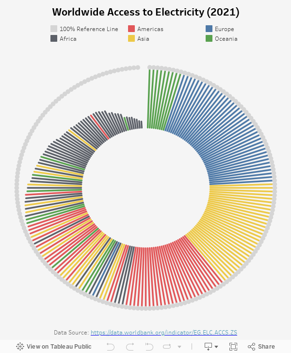
This week I was browsing World Bank Open Data for visualization inspirations and found this Access to Electricity data. The data is a bit outdated as it was last updated in 2021, but it is astonishing how certain areas worldwide still suffer from a lack of electricity.
My Visualization
I tried to be a bit creative in the visualization format this week and built a radial column chart to show the access to electricity % around the world, sorted by accessibility. Different colors represent different continents, with a circle of grey dots serving as the 100% accessibility reference line.
Please notice that all the visualizations are designed for desktop view, so it is recommended to view them on a desktop device.
Insights
- It is really sad to see that, in almost a quarter of the countries around the world, only <= 80% of the population has access to electricity.
- Those countries with low accessibility to electricity are strongly skewed towards African countries – almost all the European countries has 100% access to electricity, while only 8 African countries have over 90% access to electricity.
Follow this link to find more weekly vizzes :)