
US Monthly Electricity Generation
US Monthly Electricity Generation
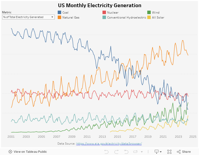
This week, inspired by the wind energy visualization by the Chartr newsletter (now part of the Sherwood newsletter), I am visualizing the breakdown of total electricity generated in the US using the source data published on the U.S. Energy Information Administration.
My Visualization
The visualization is a very simple line chart with different color representing each energy source. I was debating if I should keep the data monthly but kept it because I found the different seasonality of each energy to be interesting. You can use the metric switcher on the top to switch between absolution number and %.
Please notice that all the visualizations are designed for desktop view, so it is recommended to view them on a desktop device.
Insights
- Coal was the primary electricity source back in the early 2000s (over 50%), but its first place was taken over by natural gas in 2016, by nuclear in 2020, and by wind in the last two months;
- Solar is another emerging electricity energy source, but it has been growing relatively slowly, still accounting for less than 10% today;
- Each energy source seems to follow a different seasonality – % of electricity generated by natural gas usually spikes in the summer (July and Aug), while the % from coal seems to spike during winter (Nov to Jan), and % from wind is higher during the spring season (Mar to May). This is likely due to the availability of each energy during different times of the year.
Follow this link to find more weekly vizzes :)