
Olympic Medals vs. GDP
Olympic Medals vs. GDP
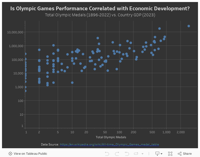
The 2024 Paris Olympic Games has started! My visualization this week is also related to the Olympics. I was initially thinking about visualizing the modal counts in the past Olympic Games. Seeing the US almost always in the top 3, I had this question – is Olympic performance somewhat correlated with the economic development of the country? Therefore, I pieced together the all-time medal data and the country GDP data on Wikipedia to answer this question.
My Visualization
The visualization type is very straightforward – it’s a scatter plot with the Olympic medals count on the X-axis and the 2023 GDP on the Y-axis.
Please notice that all the visualizations are designed for desktop view, so it is recommended to view them on a desktop device.
Insights
- Both metrics are right-skewed with a long tail, therefore I applied log-scale on then. We can clearly observe a pattern of higher GDP and higher all-time Olympic medals. This is not a surprise as sports training today, especially those at the Olympics level not only require talent, but also a significant amount of time and money to hire the best coaches and a scientific training team, and to train in professional facilities. This could be a luxury for people in less-developed countries.
- There are also confounding factors like the population of the country – of course, both the number of Olympic medals and GDP are positively correlated with the population of the country.
Follow this link to find more weekly vizzes :)