
US Income Inequality by Ethnicity
US Income Inequality by Ethnicity
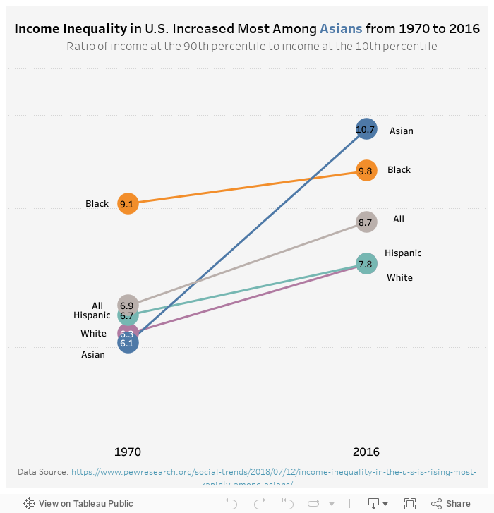
For this week’s visualization, I recreated the chart from Pew Research Center, on their report on income inequality. It provides insights into the income inequality by ethnicity, and how it is trending from 1970 to 2016. It is particularly interesting to see how Asian’s income inequality has been rising much faster than other ethnic groups in the past 40 years.
My Visualization
The visualization I created is very similar to the previous one posted on Pew Research Center – it is a line chart with year on the x-axis with different color representing ethnicities, making it easier to compare where each group were at in 1970 and 2016, and the different increase sizes.
Please notice that all the visualizations are designed for desktop view, so it is recommended to view them on a desktop device.
Insights
- Measured by the 90th percentile income to 10th percentile income ratio, Asian was the group with the lowest income inequality in 1970, however, it became the ethnicity group with the highest income inequality in 2016, with the inequality ratio rising from 6.1 to 10.7;
- Meanwhile, across the board, we also see income inequality rising in all the ethnic groups, indicating a larger social trend.
Follow this link to find more weekly vizzes :)