
Swiss Public Transportation Usage
Swiss Public Transportation Usage
I just came back from Switzerland. Two things that impressed me the most are the stunning scenery and the great public transportation system. Therefore, this week I found this dataset related to Swiss public transportation usage on their federal statistical office website. It shows various data points on Swiss public transportation development, performance, traffic volume, etc.
My Visualization
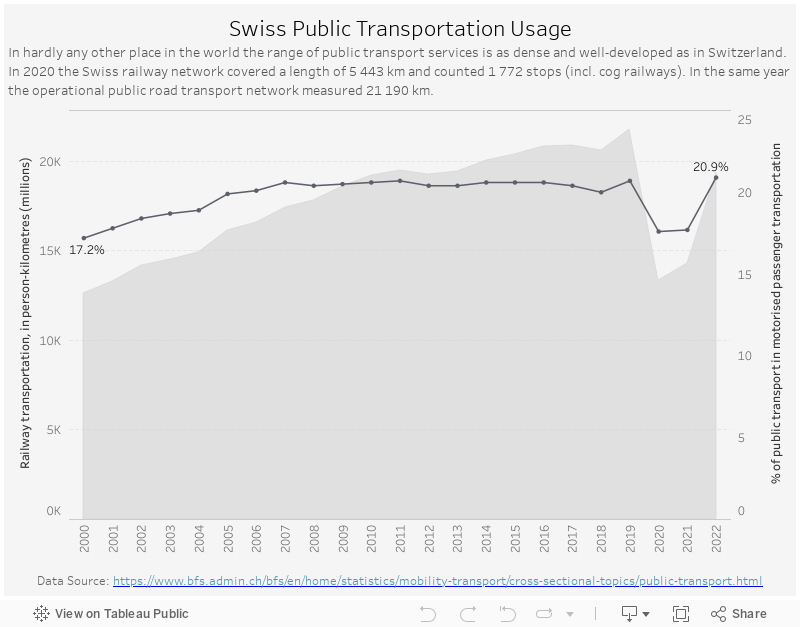
The two metrics I chose to show on the visualization are: 1. railway transportation distances in person-kilometers, presented in area chart 2. percentage of public transport in motorised passenger transportation, displayed in line chart.
Please notice that all the visualizations are designed for desktop view, so it is recommended to view them on a desktop device.
Insights
- Before COVID, the total railway transportation distances has been gradually increasing from 12.6 billion person-km in 2000 to 21.7 billion person-km in 2019 (70%+ increase);
- Meanwhile, the share of public transport in motorised passenger transportation increased ffom 17.2% in 2000 to to 20.6% in 2017, then stablized around 20.5% til 2019. This different pattern is likely due to the increase in tourists;
- During the pandemic, not surprisingly, we see a decline in both metrics. But they have bounced back in 2022 – total railway transportation distances is still below the 2019 level, but the share of public transport in motorised passenger transportation is back to 20.9%.
Follow this link to find more weekly vizzes :)