
HPV Vaccination Rate
HPV Vaccination Rate
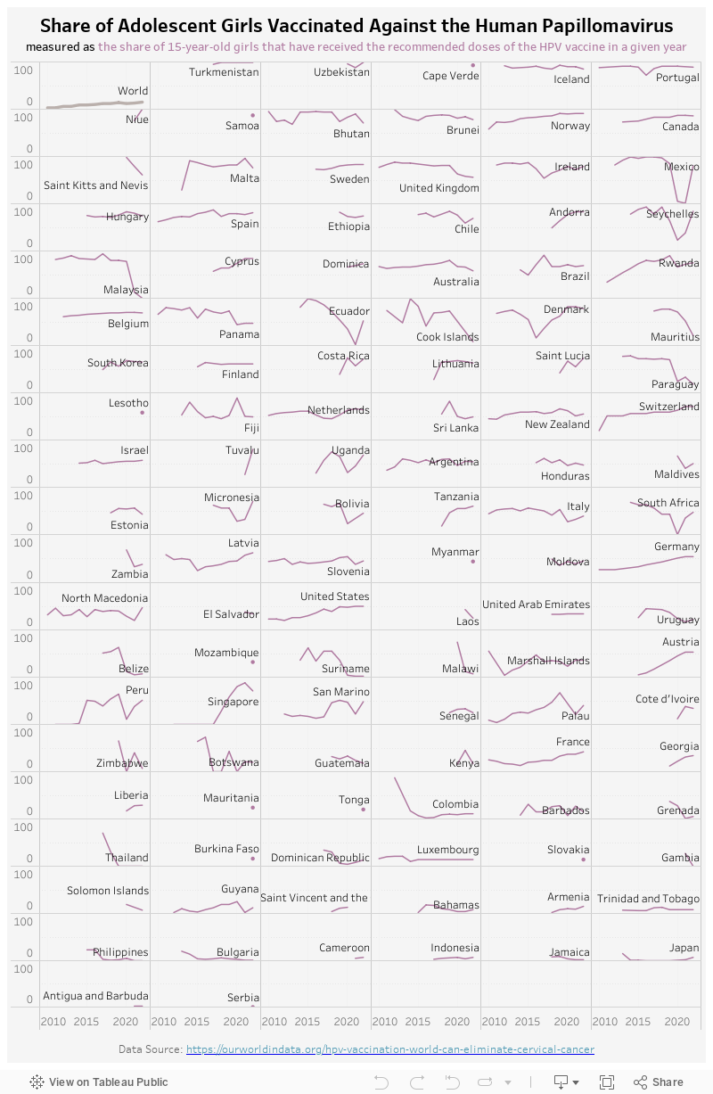
This week I turned to Makeover Monday for some data visualization inspiration and found this article about HPV Vaccination. It has very detailed explanation of why HPV vaccine is important and effective, and data around the vaccination rate across the world. Therefore, I decided to create a visualization of the HPV vaccination rate by country over time.
My Visualization
This visualization plots the HPV vaccination rate trend by country in a grid view, ordered by the average rate when data is available.
Please notice that all the visualizations are designed for desktop view, so it is recommended to view them on a desktop device.
Insights
- Generally speaking, European countries show higher HPV vaccine adoption, while countries in Africa and Asia have lower vaccination rate;
- As the article pointed out, factors like vaccine costs, supply, national policy, and targeted campaigns can all impact vaccination rates. With the world’s average HPV vaccination rate only at 15%, there is still a lot we need to do to eliminate the cervical cancer.
Follow this link to find more weekly vizzes :)