
World Life Expectancy
World Life Expectancy
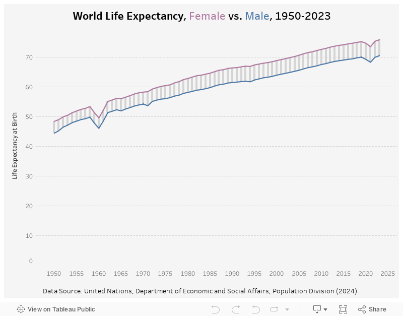
The dataset I am visualizing this week comes from the World Population Prospects report by the United Nations, Department of Economic and Social Affairs. It has tons of insightful demographics data regarding population, fertility, morality, etc. The specific data points I will use is the life expectancy at birth by gender. It shows an interesting trend from 1950 to 2023.
My Visualization
The visualization is a combination of line chart and gantt chart (yes the small bars in between the two lines are made with gantt chart). It shows the life expectancy for female and male each year, and their differences.
Please notice that all the visualizations are designed for desktop view, so it is recommended to view them on a desktop device.
Insights
- From 1950 to 2023, both genders’ life expectancy has been increasing gradually (except for a few years like 2021 with public health crisis), and their trends follow each other closely;
- However, if we look at the gap, the differences between female and male life expactancy has been expanding from ~3.5 in 1950s to 5.3 lately.
Follow this link to find more weekly vizzes :)