
US Immigration Waves
US Immigration Waves
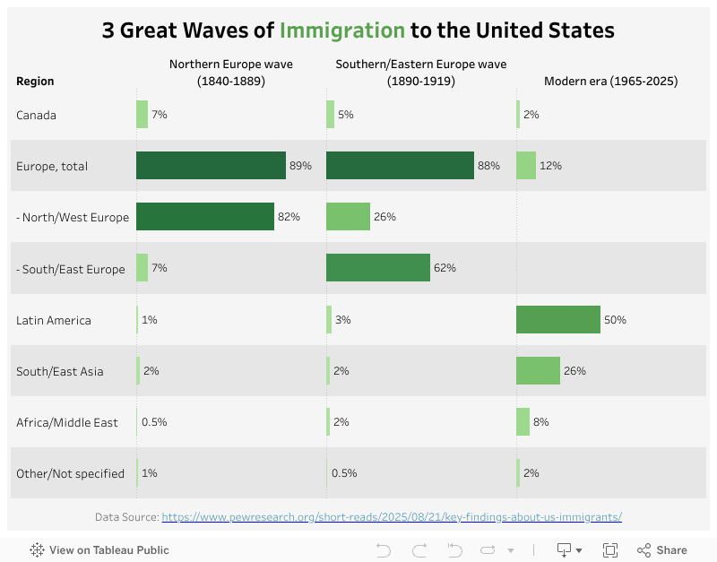
The US is an immigration country with people originally from all over the world. This report from the Pew Research Center highlighted the US immigration history with data. My visualization this week is based on the table of the three great waves of immigration to the US in this report.
My Visualization
This visualization is a two-dimensional bar chart that shows the % of immigrants by era and region.
Please note that all the visualizations are designed for desktop view, so it is recommended to view them on a desktop device.
Insights
- The three great waves of immigration to the US have very different distributions of immigrant origins. The first one (1840-1889) consists of more than 80% of immigrants from North/West Europe; More than half of the second one (1890-1991) immigrants came from South/East Europe; While the latest wave of immigrants has more diversity with ~50% from Latin America and 26% from South/East Asia.
Follow this link to find more weekly vizzes :)