
From Web Pages to Insights: Integrating Web Scraping and Text Analysis with GPT
Use GPT to summarise content and extract structured data from web pages
In a past article, I explored how to summarize and categorize text using the OpenAI API. In this post, I will take it one step further and show you how to integrate web scraping into this workflow to extract structured data info from a series of web pages.
Context
I have been making one visualization weekly since I started my full-time DS job in 2018. Initially, I followed the datasets posted every week by makeovermonday.co.uk. However, they paused the project in September 2021 for about one year. Running this community every week is a huge commitment so I completely understand the need for a break. As a result, starting in October 2021, I have been finding my datasets to visualize every week. The topics are mostly inspired by my interests or experience. It has been 139 visualizations since then, so sometimes I wonder what my favorite data topics and visualization types are.
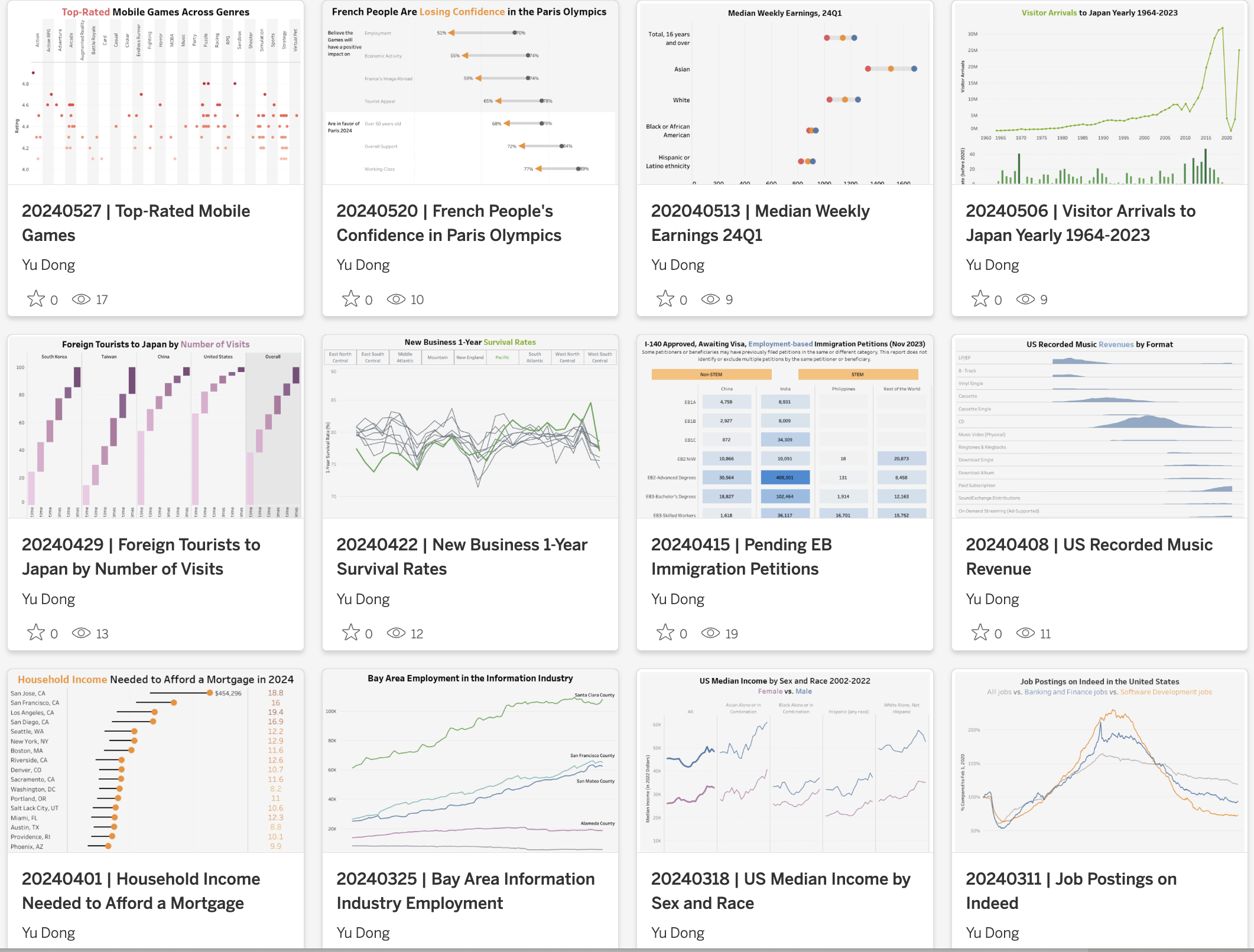
While I have visualization catalog pages with a running list of visualization titles and data sources, it doesn’t tell the visualization topic details and the specific chart types I used. Instead, I need to read through the 139 weekly visualization posts to identify them, which is not realistic. Therefore, it’s time to get help from web scraping and the OpenAI API.
Step I - Prepare the URL Lists
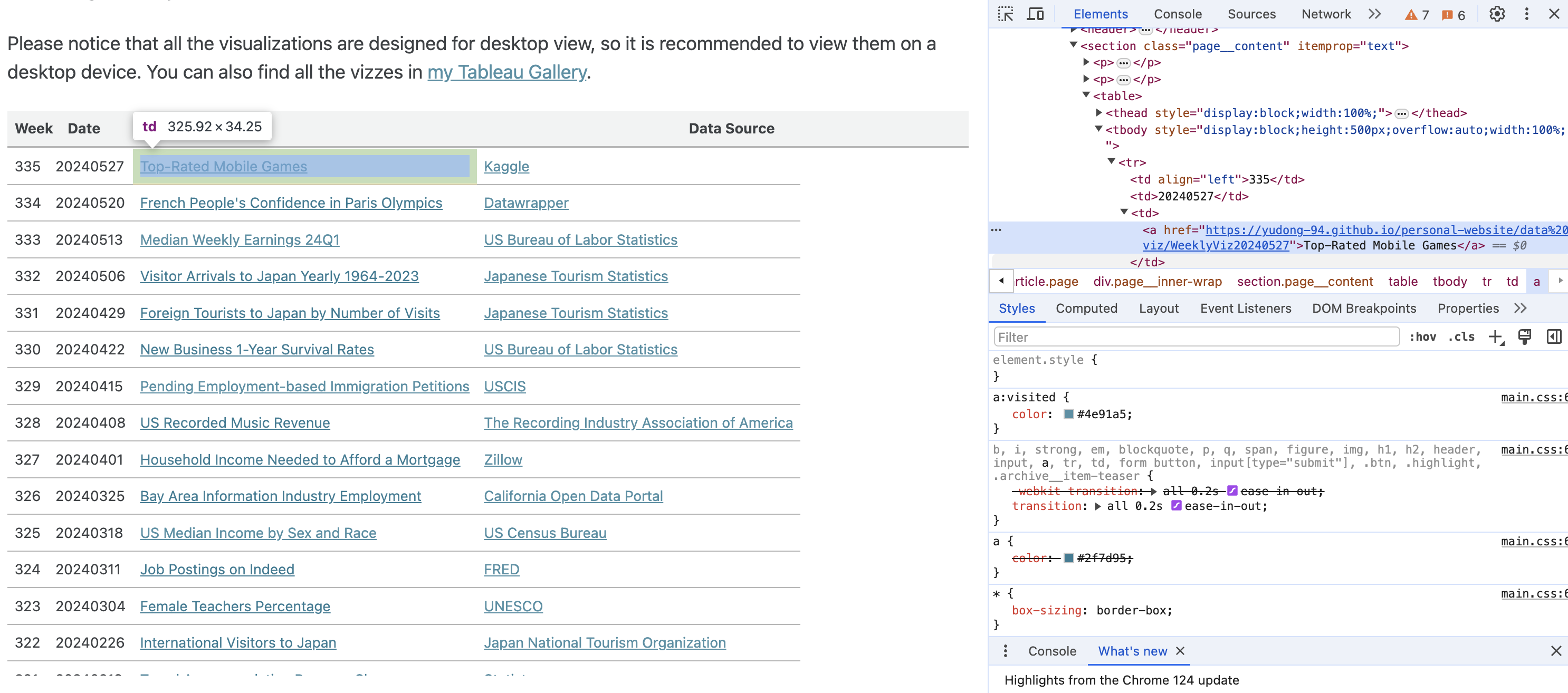
To get the list of URLs to those visualization posts, it is easiest to scrap the list from my visualization catalog pages. Let’s start with the 2024 page. By inspecting the HTML code, you can see the URLs are embedded in the ‘table’ tags within the ‘page__content’ class.
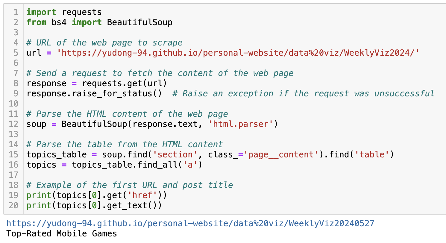
With the help of GPT, I wrote the code below to fetch the URL and the post title using the BeautifulSoup package.
Now that we have success with the 2024 visualization catalog page, let’s loop through the pages from 2021 to 2024 to get the full list.
years = ['2021', '2022', '2023','2024']
url = 'https://yudong-94.github.io/personal-website/data%20viz/WeeklyViz'
viz_urls = []
viz_titles = []

for y in years:
    year_url = url+y
    # example URL: https://yudong-94.github.io/personal-website/data%20viz/WeeklyViz2024/

    # Send a request to fetch the content of the web page
    response = requests.get(year_url)
    response.raise_for_status()  # Raise an exception if the request was unsuccessful

    # Parse the HTML content of the web page
    soup = BeautifulSoup(response.text, 'html.parser')

    # Extract the a tags
    viz_table = soup.find('section', class_='page__content').find('table')
    a_tags = viz_table.find_all('a')

    for t in a_tags:
        href = t.get('href')
        text = t.get_text()
        # filter on tags with blog links
        if href:
            # only keep the ones following the WeeklyViz URL format
            if 'https://yudong-94.github.io/personal-website/data%20viz/WeeklyViz' in href:
                viz_urls.append(href)
                viz_titles.append(text)
Step II - Parse Visualization Blog Content
The next step is to parse out the text body from each visualization blog (example) so we can feed them to the OpenAI API.
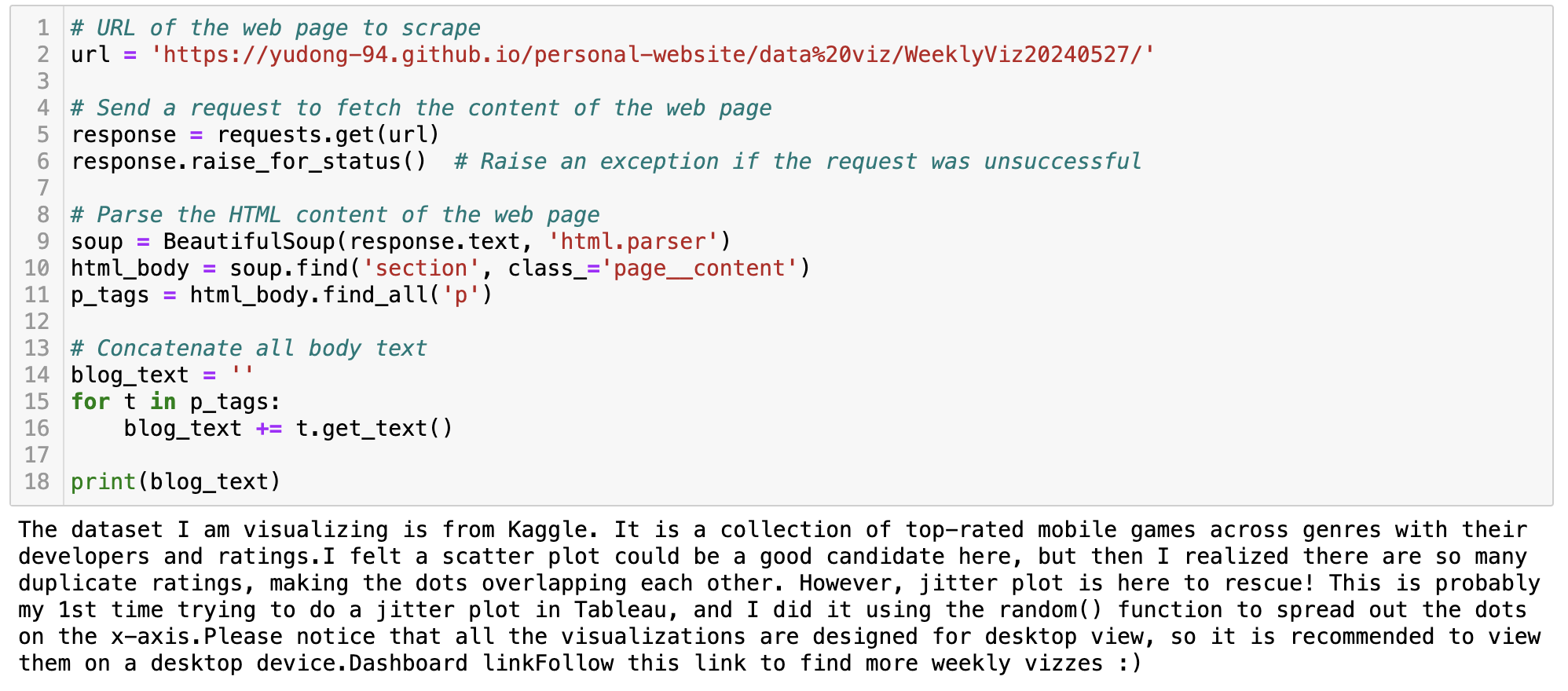
My visualization blogs are written in markdown and the site is published via GitHub Pages. Therefore, it might look slightly different from many other websites. In this case, the body text can be found under the ‘p’ tag in the ‘page__content’ class. Here is a similar code block to extract the text.
Step III - Text Summarization and Categorization with the OpenAI API
In the above steps, we have prepared the URL list and the code snippet to extract the text content. Now it’s time to ask GPT to conduct some text analysis. We have three objectives:
- Summarise the visualization topic, for example, “Top-rated mobile games by genre”. This should usually align with the post title.
- Categorize the topics category, for example, “Entertainment”. I prepared a list of predefined categories for GPT to choose from. The list could be created based on your domain knowledge, or you can ask GPT to generate a list as described in the last post.
- Extract the visualization type, for example, “Line chart”. This is usually described in the 2nd paragraph of my weekly visualization post. I also prepared a predefined list for this one so GPT doesn’t give me values in slightly different formats (hopefully).
To achieve these goals, the key part is to write the prompt. Here is the final prompt after rounds of iteration. For example, I tried to omit the category descriptions, but it outputted lots of ‘Others’. So one takeaway is always to be specific and detailed if possible.
prompt = f"""
    Below is the text content of my weekly visualization blog post. I describes visualization data source, visualization types, and insights in the post.
    '''
    {blog_content}
    '''
    Please extract the "visualization topic", "topic category", "visualization type" from the blog post.

    1. "visualization topic": the topic of the visualizations.

    2. "topic category": the category of the visualization topic. It should be one of the below values:
    - "Economics": topics related to inflation rates, stock market performance, and housing market trends, etc.
    - "Technology": topics related to AI, cybersecurity, and different softwares, etc.
    - "Education": topics related to schools, online courses, and graduation, etc.
    - "Health": topics related to healthcare trends, medical science, and diseases, etc.
    - "Environment": topics related to temperature, natural disasters, global warming, etc.
    - "Travel": topics related to vacation destinations, and tourism statistics, etc.
    - "Business": topics related to startups, IPO, layoffs, and work habits, etc.
    - "Entertainment": topics related to movie, music, gaming, and social media trends, etc.
    - "Social Issues": topics related to gender equality, racial disparities, and crime rates, etc.
    - "Others": other topics that do not fall under any of the above categories.

    3. "visualization type": the type of the visualization.

    The output MUST follow the JSON format as shown in the example below.

    Example:
    '''
    {"visualization_topic":"Unemployment Rate 2000-2024",
     "topic_category":"Economics",
     "visualization_type":"Line chart"}
    '''
"""
I also used the function calling capability for consistent JSON output. The code below specifies function arguments. This helps to enforce GPT output to always follow your desired JSON format and reduce data pipeline errors.
func = [
    {
        "name": "extract_visualization_info",
        "description": "Extract visualization information",
        "parameters": {
            "type": "object",
            "properties": {
                "visualization_topic": {
                    "type": "string",
                    "description": "The topic of the visualization",
                },
                "topic_category": {
                    "type": "string",
                    "enum": [
                        "Economics",
                        "Technology",
                        "Education",
                        "Health",
                        "Environment",
                        "Travel",
                        "Business",
                        "Entertainment",
                        "Social Issues",
                        "Others"
                    ],
                    "description": "The category of the visualization topic",
                },
                "visualization_type": {
                    "type": "string",
                    "enum": [
                        "Line chart",
                        "Bar chart",
                        "Scatter chart",
                        "Bubble chart",
                        "Gantt chart",
                        "Bump chart",
                        "Heatmap",
                        "Radial chart",
                        "Map",
                        "Others"
                    ],
                    "description": "The type of the visualization",
                },
            },
            "required": ["visualization_topic", "topic_category", "visualization_type"],
        },
    },
]
Now let’s piece together the code – loop through the blog URLs, extract the three pieces of information, and store them in a data frame. I am using the gpt-3.5-turbo model here for cost reasons, but it is sufficient in this use case.
def extract_info(blog_content, model="gpt-3.5-turbo"):
    ## main function to feed the blog content to the OpenAI API
    ## and extract visualization_topic, topic_category, and visualization_type

    prompt = f"""
    Below is the text content of my weekly visualization blog post. I describes visualization data source, visualization types, and insights in the post.
    '''
    {blog_content}
    '''
    Please extract the "visualization topic", "topic category", "visualization type" from the blog post.

    1. "visualization topic": the topic of the visualizations.

    2. "topic category": the category of the visualization topic. It should be one of the below values:
    - "Economics": topics related to inflation rates, stock market performance, and housing market trends, etc.
    - "Technology": topics related to AI, cybersecurity, and different softwares, etc.
    - "Education": topics related to schools, online courses, and graduation, etc.
    - "Health": topics related to healthcare trends, medical science, and diseases, etc.
    - "Environment": topics related to temperature, natural disasters, global warming, etc.
    - "Travel": topics related to vacation destinations, and tourism statistics, etc.
    - "Business": topics related to startups, IPO, layoffs, and work habits, etc.
    - "Entertainment": topics related to movie, music, gaming, and social media trends, etc.
    - "Social Issues": topics related to gender equality, racial disparities, and crime rates, etc.
    - "Others": other topics that do not fall under any of the above categories.

    3. "visualization type": the type of the visualization.

    The output MUST follow the JSON format as shown in the example below.

    Example:
    '''
    {"visualization_topic":"Unemployment Rate 2000-2024",
     "topic_category":"Economics",
     "visualization_type":"Line chart"}
    '''
    """

    messages = [{"role": "user", "content": prompt}]
    response = openai.chat.completions.create(
        model=model,
        messages=messages,
        temperature=0,
        tools=[{"type":"function", "function":func[0]}], #function calling
        response_format={"type":"json_object"} #force JSON output
    )

    func_response = response.choices[0].message.tool_calls[0].function.arguments
    func_arguments = json.loads(func_response)

    return func_arguments

## loop through the URL lists and store the OpenAI responses
## you should add some error handling logic in a production data pipeline
viz_summary = []

for i in range(len(viz_urls)):
    title = viz_titles[i]
    url = viz_urls[i]
    viz_date = url[-8:]

    # Send a request to fetch the content of the web page
    response = requests.get(url)
    response.raise_for_status()  # Raise an exception if the request was unsuccessful

    # Parse the HTML content of the web page
    soup = BeautifulSoup(response.text, 'html.parser')
    html_body = soup.find('section', class_='page__content')

    # Get p tags for blog body text
    p_tags = html_body.find_all('p')

    # Concatenate the blog text
    blog_text = '**' + title + '**:'
    for t in p_tags:
        blog_text += t.get_text()

    # add other fields
    viz_classification = extract_info(blog_text)
    viz_classification['id'] = i
    viz_classification['date'] = viz_date
    viz_classification['url'] = url
    viz_classification['title'] = title

    viz_summary.append(viz_classification)

viz_summary_df = pd.DataFrame(viz_summary)
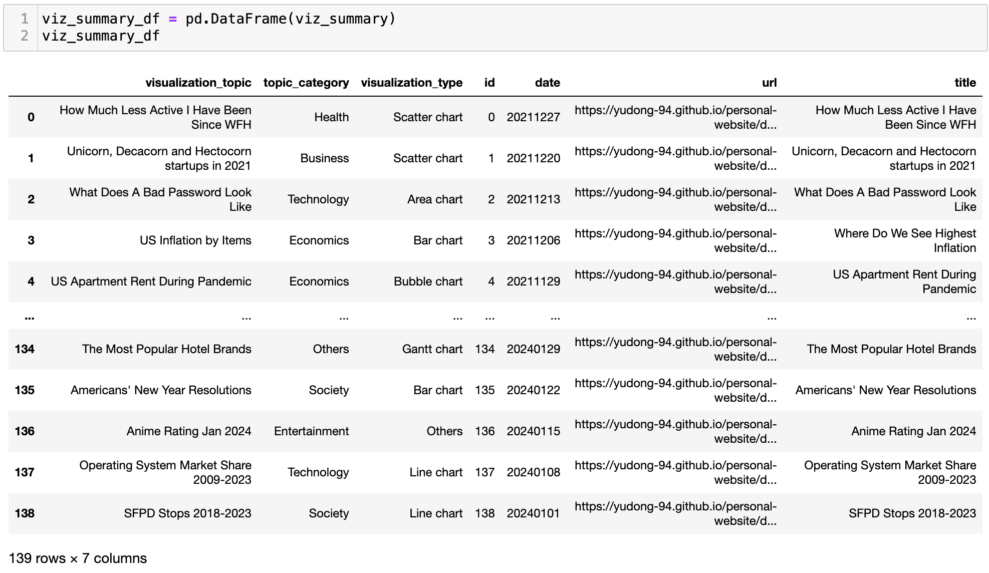
It’s also necessary to do a quick data validation on the output. As observed in the last post, there are always cases where GPT outputted values are not in the predefined value lists. For example, here it created a new category ‘Society’, which overlaps with the ‘Social Issues’ value I provided – well, maybe ‘Society’ is a better name… I ended up making some manual adjustments myself to overwrite those outlier values.
Visualization Habit Analysis
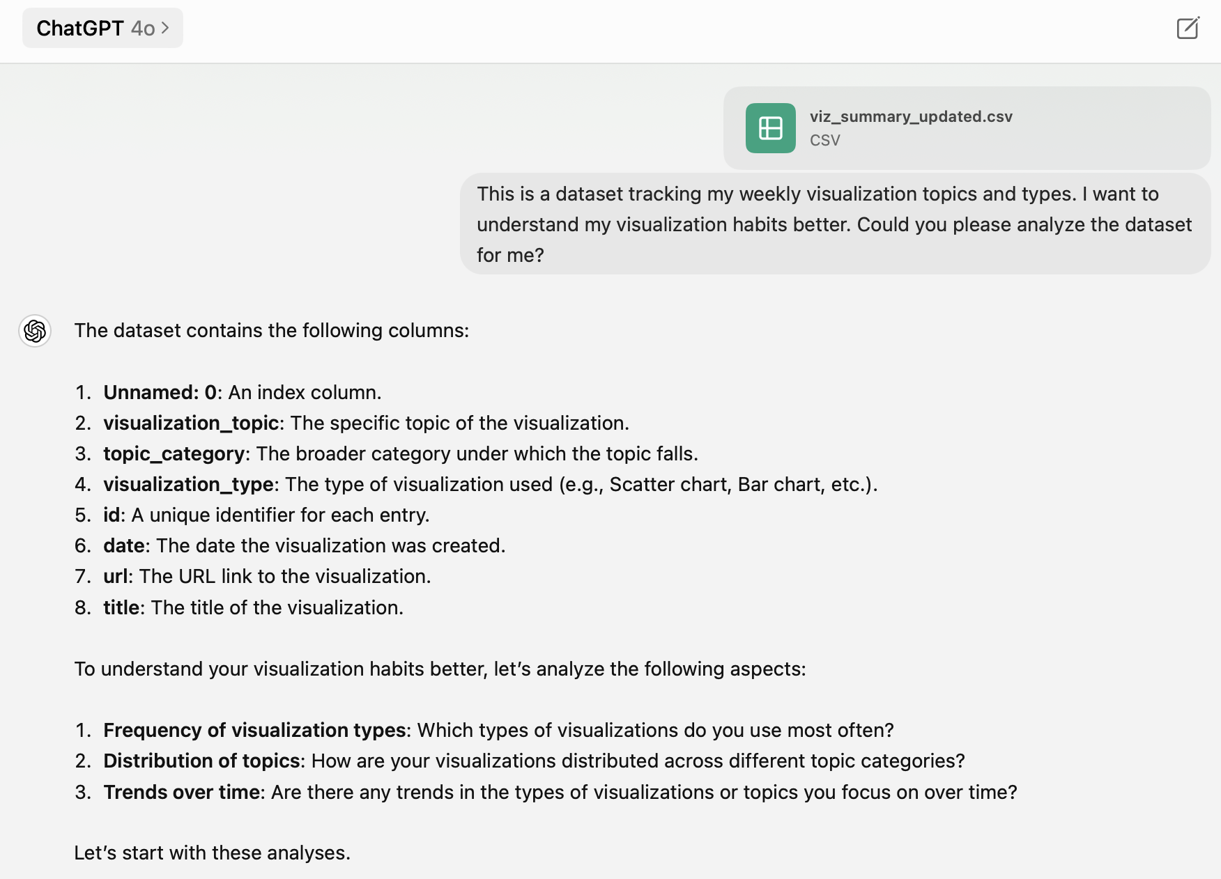
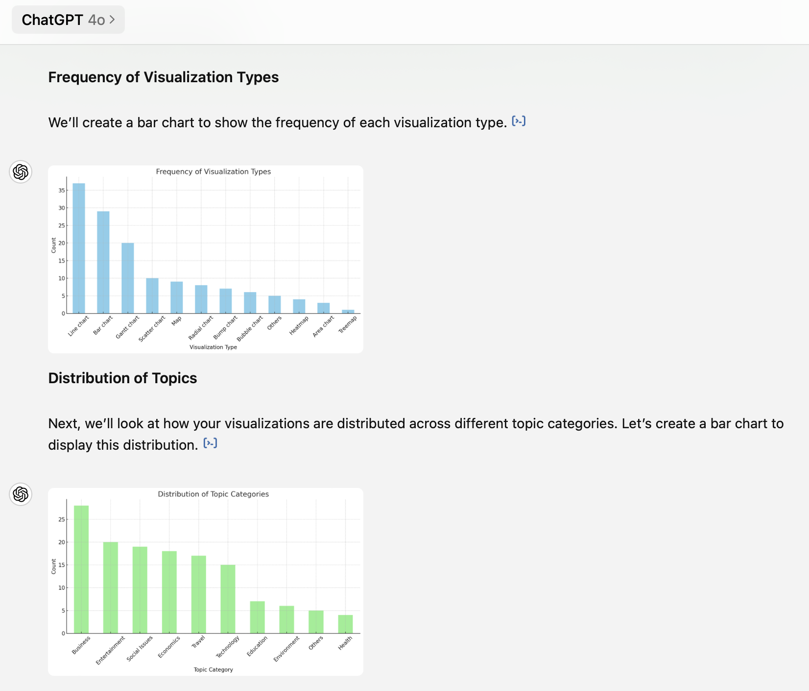
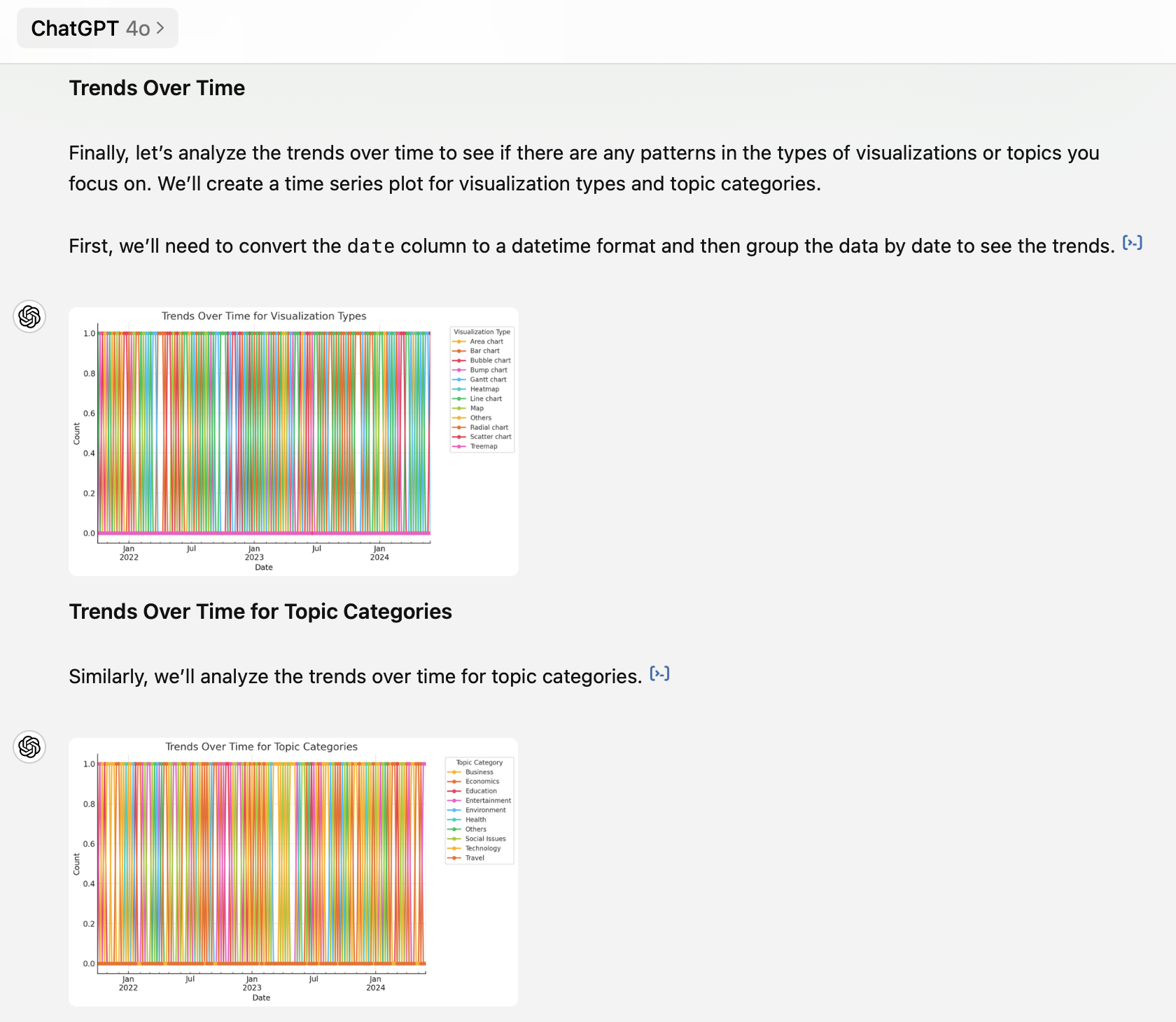
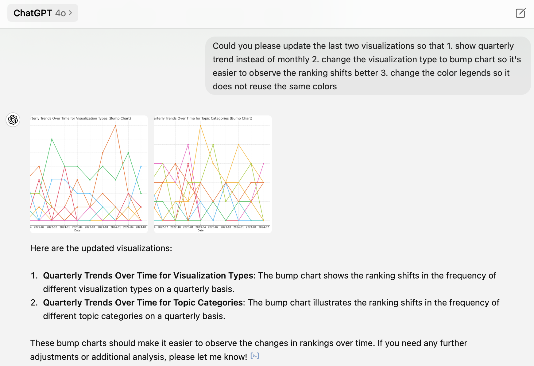
Now let’s go back to my visualization habit questions. I shared the cleaned dataset in a CSV file with ChatGPT 4o and it did the analysis and created visualizations automatically for me. I like how it captured the main questions and the table structure accurately. It can make basic charts quickly, but not always in the best way. For example, the two trends over time charts are too messy and hardly readable. Therefore, I had to provide guidance on how to improve them – yet ChatGPT failed to follow my instruction of not reusing the same label color… It also doesn’t provide any interpretations of the charts. You can find a more comprehensive evaluation of ChatGPT’s data analysis capability here.
Here are my main takeaways from this dataset:
1. Line and bar charts are the two dominant chart types, followed by Gantt charts
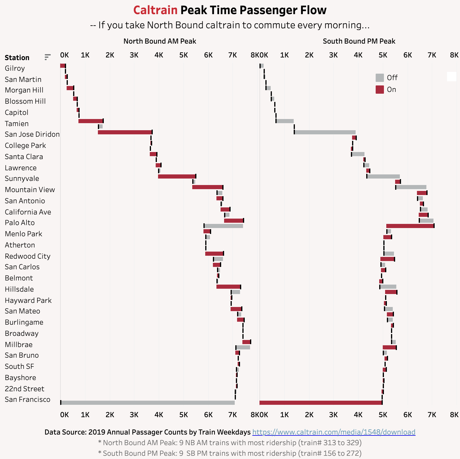
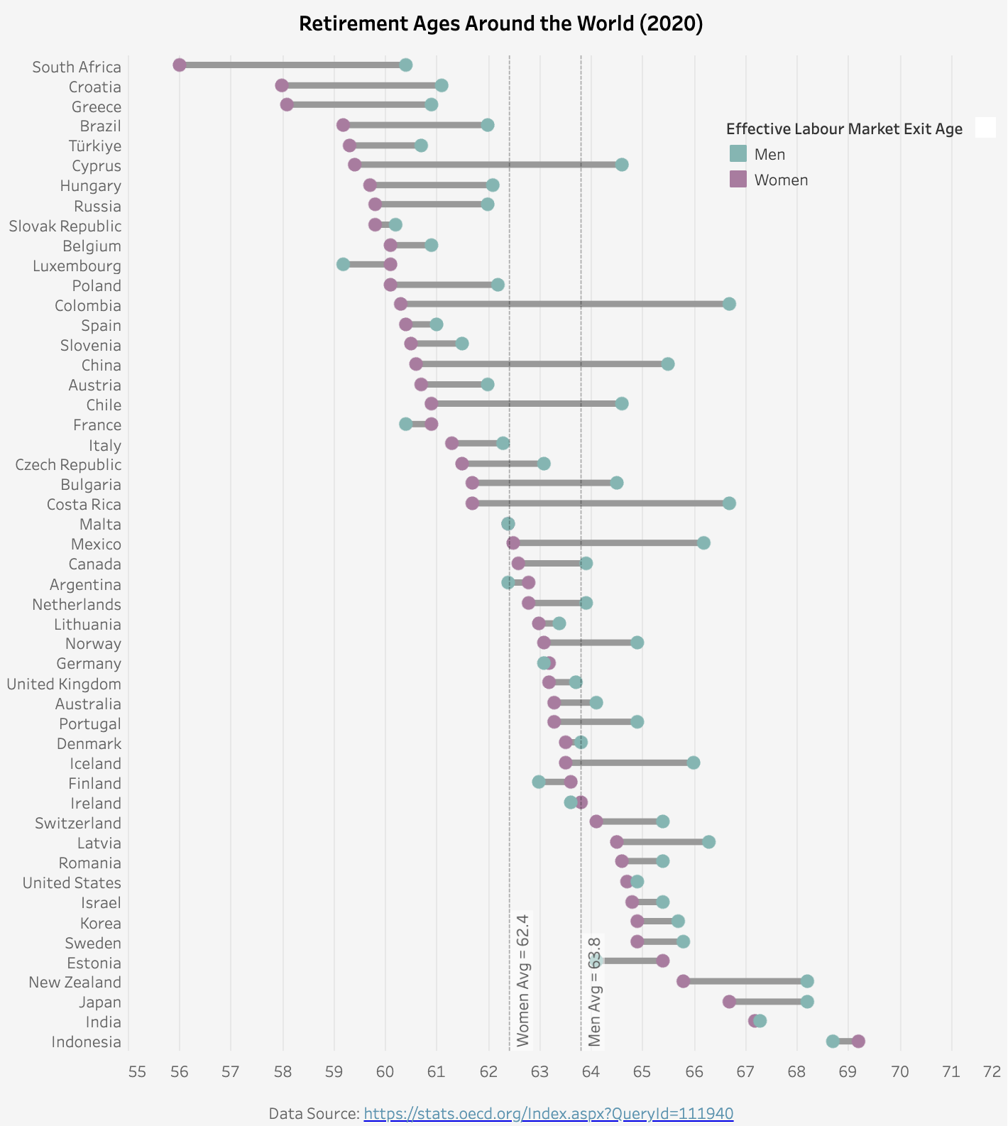
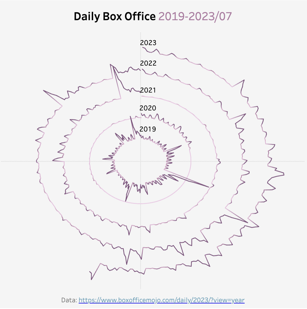
It’s not a surprise that line charts and bar charts are the top two common types (47% combined). These are basic, simple, but straightforward ways of visualization. My third favorite chart type is the Gantt chart (14%). The Gantt chart is usually used as a project management tool. However, in Tableau, it is a very powerful tool to make plots that do not start from 0. I often use it to show changes or differences between two groups or two time points. You can find two Gantt chart examples below. The first one visualizes the Caltrain passenger flow at each station during the morning commute time. The second one plots the differences between men’s and women’s retirement ages around the world.
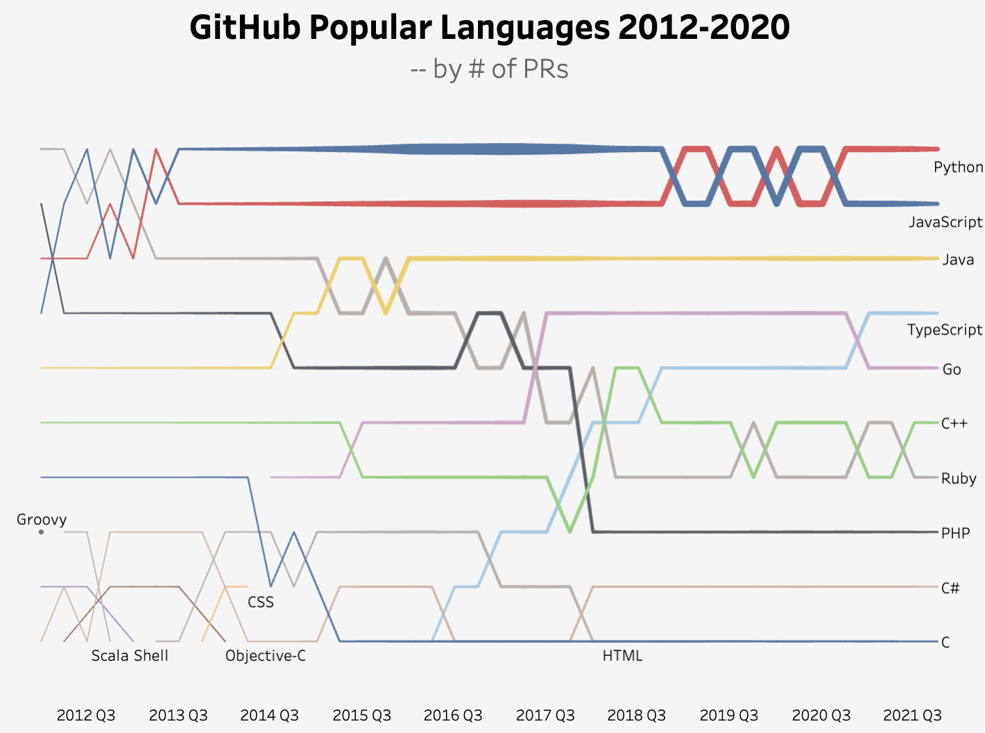
I have also used some less common visualization types like radial charts and bump charts. The prior is used to show comparisons among categories in circular shapes (Tableau example link), and the latter is useful to visualize the ranking shifts over time (Tableau example link).
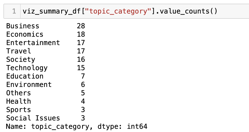
2. Business is my favorite visualization topic
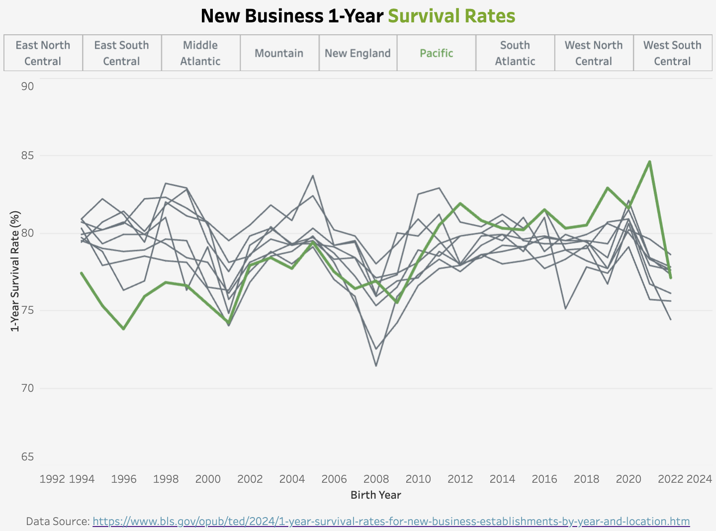
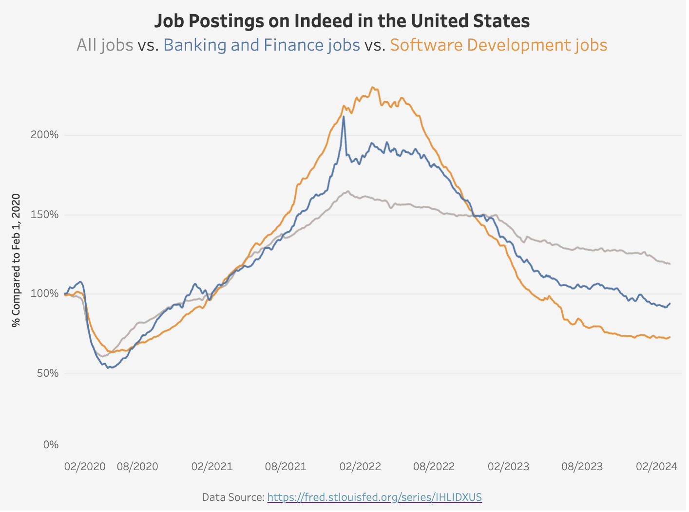
Working at a startup, I am fascinated by entrepreneurship data points. The recent macroeconomics concerns and waves of tech layoffs also inspired several visualization ideas. Here are two examples: the first one shows the new business’s 1-year survival rate by region, and the second one shows the job postings on Indeed by selected industries.
I will write more in the future about my weekly visualization journey. Stay tuned if you are interested!
Final Thoughts
In the above example, I demonstrated how to integrate web scraping with the text analytics capabilities offered by GPT models. I used my portfolio site to showcase a relatively simple process here, but this approach unlocks many opportunities to extract information in a structured manner from web pages. Whether you are a data scientist, a researcher, or just someone interested in extracting insights from web pages, these techniques can save you significant time and effort.
Last but not least, web scraping could violate a website’s terms of service. Please make sure to check out the website’s policy first and use official APIs when appropriate.