
World Drugs and Medicine Trade
World Drugs and Medicine Trade
About Makeover Monday
MakeoverMonday is a social data project: “Each week we post a link to a chart, and its data, and then you rework the chart. Maybe you retell the story more effectively, or find a new story in the data. We’re curious to see the different approaches you all take. Whether it’s a simple bar chart or an elaborate infographic, we encourage everyone of all skills to partake. Together we can have broader conversations about and with data.”
Starting from Jan 08, 2018, I decided to put aside one hour on Monday weekly to create some visualization and find some insights from the data.
The datasets are published each week at: MakeoverMonday Datasets.
Makeover Monday 0219
This week’s data is about the world trade of drugs and medicine. The original visualization is shown below. It could be found here.
 This viz uses the size of the circles to present the drugs and medicine export size of each country,
and is visually striking as one can easily see that the size/population of the country is not neccessarily corresponding with its export volume of drugs and medicine.
This viz uses the size of the circles to present the drugs and medicine export size of each country,
and is visually striking as one can easily see that the size/population of the country is not neccessarily corresponding with its export volume of drugs and medicine.
My Visualization
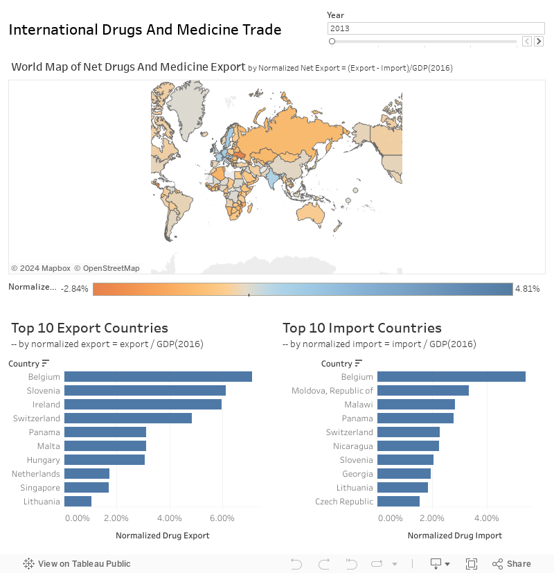
As the dataset provided this week is rather simple and straightforward - country, year, and its drugs and medicine export, to understand more about the whole picture of world trade of drugs and medicine, and to make these numbers more comparable, I spent some time to find the drugs and medicine import data and GDP by country data. You know, finding data and cleaning data is always the beginning part, and sometimes, the most time-consuming part of an analysis/ visualization:) I normalized all the absolute imports / exports values by the GDP of that country, to see how much this section of international trade counted to the commerce of the whole country.
Below is my dashboard. You can drag the slider to observe the trade pattern from 2013 to 2017, and hover on the countries to see the imports and exports volume. Please notice that the data of 2017 is not complete - many countries still do not have the export/import data.
–
Please notice that all the visualizations are designed for desktop view, so it is recommended to view them on a desktop device.
–
Insights
- When normalized by GDP, the net drugs and medicine export of Ireland is the highest, and most of the countries with high exports (those in blue) are in Europe, with India as an exception;
- Meanwhile, Russian and most African countries highly rely on imports of drugs and medicine;
- High exports does not neccessarily means low imports, vice versa. For example, Belgium is both the top 1 import country and export country in 2013. This could be due to the imbalanced demand and supply of different categories of drugs and medicine;
- From 2013 to 2016, the international trade pattern of drugs and medicine does not change much.
Follow this link to find more weekly vizzes :)