
America’s Racial Breakdown by State
America’s Racial Breakdown by State
About Makeover Monday
MakeoverMonday is a social data project: “Each week we post a link to a chart, and its data, and then you rework the chart. Maybe you retell the story more effectively, or find a new story in the data. We’re curious to see the different approaches you all take. Whether it’s a simple bar chart or an elaborate infographic, we encourage everyone of all skills to partake. Together we can have broader conversations about and with data.”
Starting from Jan 08, 2018, I decided to put aside one hour on Monday weekly to create some visualization and find some insights from the data.
The datasets are published each week at: MakeoverMonday Datasets.
Makeover Monday 20210726
This week’s dataset is about diversity – America’s racial breakdown by state. I like the original viz as it combines the US map with treemap visualization for easy understanding and comparison.
My Visualization
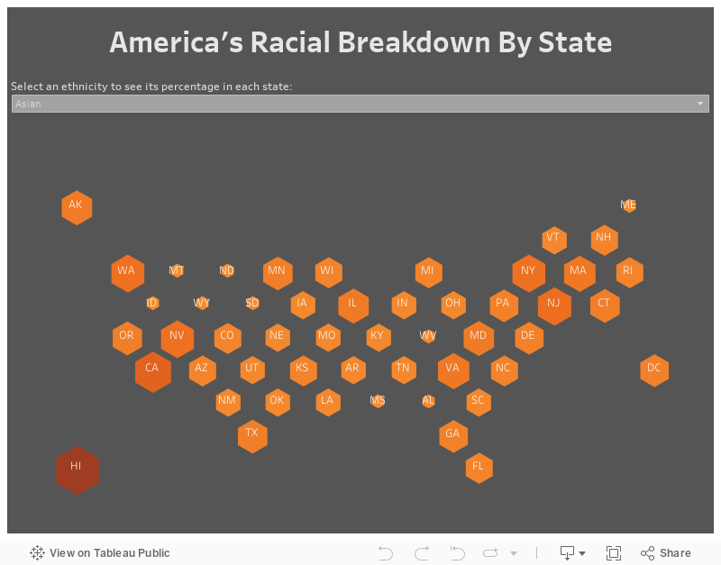
With a similar idea, I made a hex-tile US map, and adjusted color and size with the ethnicity share in every state.
–
Please notice that all the visualizations are designed for desktop view, so it is recommended to view them on a desktop device.
–
Insights
- States on the east and west coasts show highest percentage of non-white population, for example, CA only has 36% white people;
- For the minority ethinicities, we see some obvious pattern in where they live – lots of Asian live in CA, WA, NJ and NY; States on the Mexico borders like TX, NM and CA see highest percentage of Hispanic; While southeast states see most black American.
Follow this link to find more weekly vizzes :)