
US Population Projection by Age Group 2016-2060
US Population Projection by Age Group 2016-2060
About Makeover Monday
MakeoverMonday is a social data project: “Each week we post a link to a chart, and its data, and then you rework the chart. Maybe you retell the story more effectively, or find a new story in the data. We’re curious to see the different approaches you all take. Whether it’s a simple bar chart or an elaborate infographic, we encourage everyone of all skills to partake. Together we can have broader conversations about and with data.”
Starting from Jan 08, 2018, I decided to put aside one hour on Monday weekly to create some visualization and find some insights from the data.
The datasets are published each week at: MakeoverMonday Datasets.
Makeover Monday 1105
This week’s data is from US Census – US Population Projection 2016-2060. It has four dimensions: sex, origin, race, and age group. The original viz is displayed below, and it shows that US is getting aging.
 [Source: U.S. Census Bureau]
My Visualization
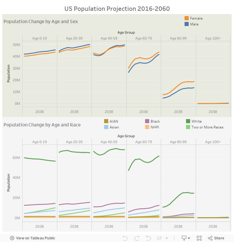
Excepting knowing that older people consist of higher proportion in US over time, it’s also interesting to see the sex and race distribution. I combined these dimensions with the age group dimension to show the change in the generations as well.
–
Please notice that all the visualizations are designed for desktop view, so it is recommended to view them on a desktop device.
–
Insights
- For new-born, actually there are always more male than females. However, after 60 days old, in older generations, females begin to have a higher proportion – corresponding with the general perception that females have longer longevity;
- Though the population size of young White people is predicted to decline over time, it’s not the case for the other races;
- We are seeing some very weird spike of population projection around 2030 for Age 60-79, which is potentially related to the baby boom in 1950s and 60s.
Follow this link to find more weekly vizzes :)