
Diversity in Tech
Diversity in Tech
About Makeover Monday
MakeoverMonday is a social data project: “Each week we post a link to a chart, and its data, and then you rework the chart. Maybe you retell the story more effectively, or find a new story in the data. We’re curious to see the different approaches you all take. Whether it’s a simple bar chart or an elaborate infographic, we encourage everyone of all skills to partake. Together we can have broader conversations about and with data.”
Starting from Jan 08, 2018, I decided to put aside one hour on Monday weekly to create some visualization and find some insights from the data.
The datasets are published each week at: MakeoverMonday Datasets.
Makeover Monday 1112
This week’s dataset is around the diversity data of US tech companies – include the % of male and female, and % of different ethnicities. I like the original viz a lot! It’s neat, interactive, and straightforward. It’s absolutely a good exmaple of visualization.
My Visualization
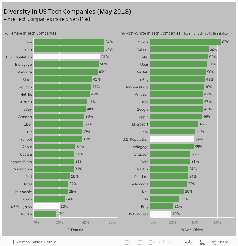
This week, I just did something simple – bar charts to compare the diversity of gender and ethinicity among different tech companies and against US population and US congrass as benchmark.
–
Please notice that all the visualizations are designed for desktop view, so it is recommended to view them on a desktop device.
–
Insights
- US Congress has a super low % of Female compare to the overall US Population distribution – I would say this is not a good thing;
- Most tech companies in this dataset have less than half female employees – typically there are more male engineers than female, though this could just be the result of social sterotype;
- As of ethnicity diversity, the non-White % in US Congress is also much lower than in the US population…;
- More than half of the tech companies have better ethinicity diversity – they have higher proportion of non-white people comparing to US population, though many of the minority employees might not be US citizens.
Follow this link to find more weekly vizzes :)